Home Tours
Explore Mulberry Manor; an Australian Coastal Dream Home
Instagram: mulberry_manor
Style Sourcebook Profile: Mulberry Manor
Builder: Ausmar Homes
Photographer: Villa Styling
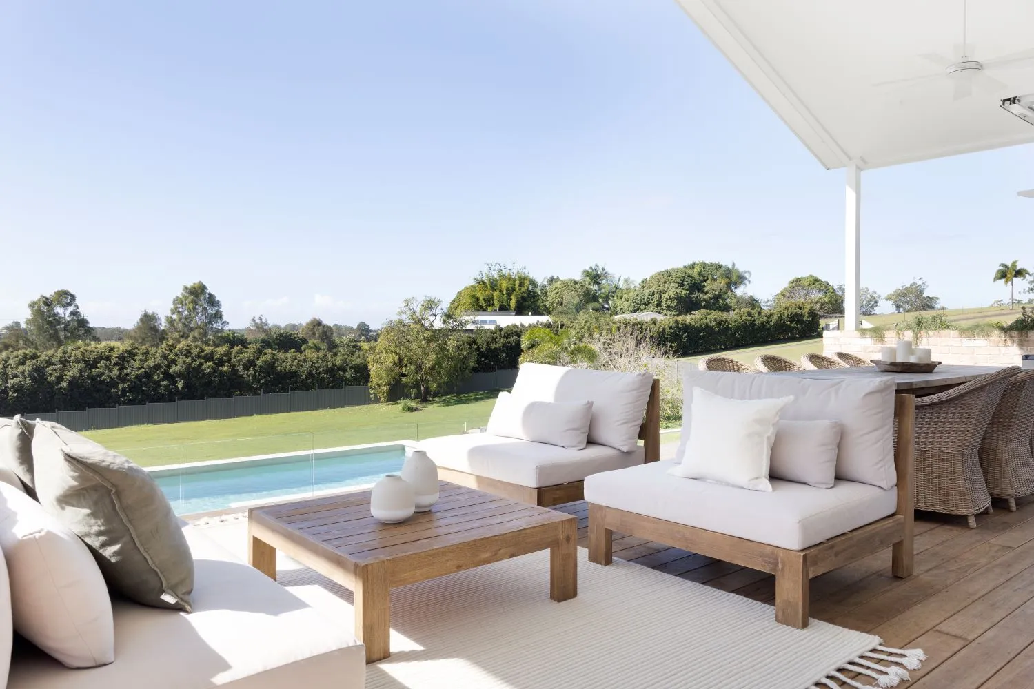
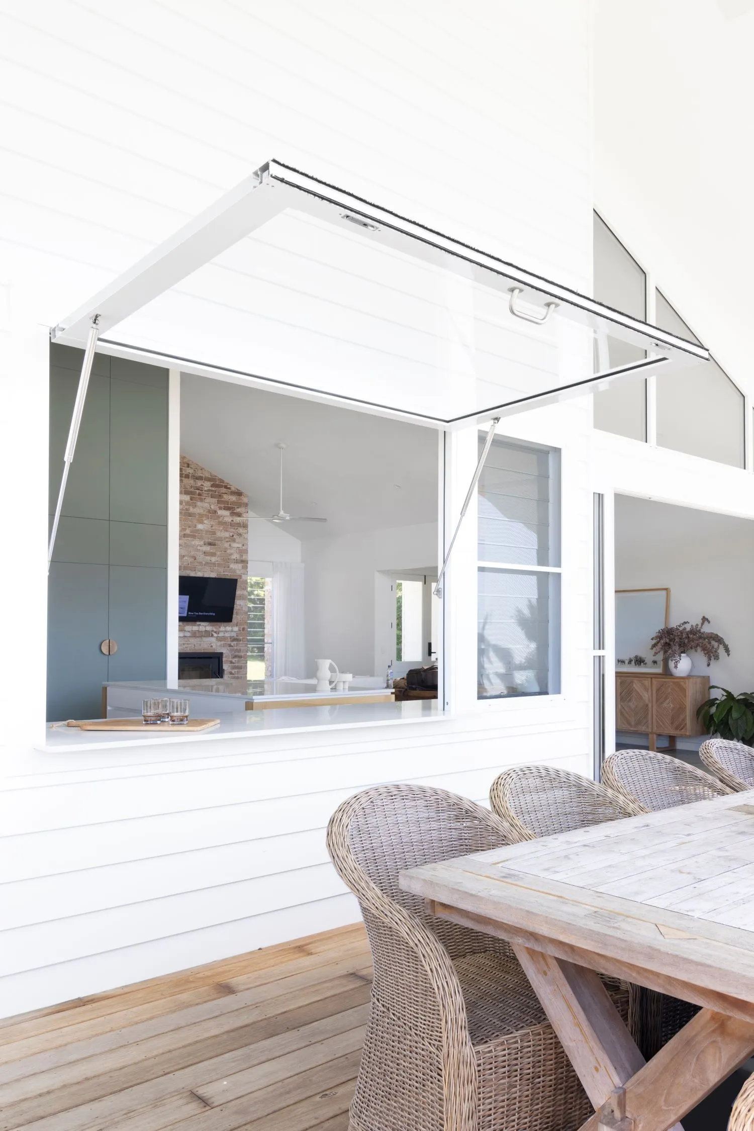
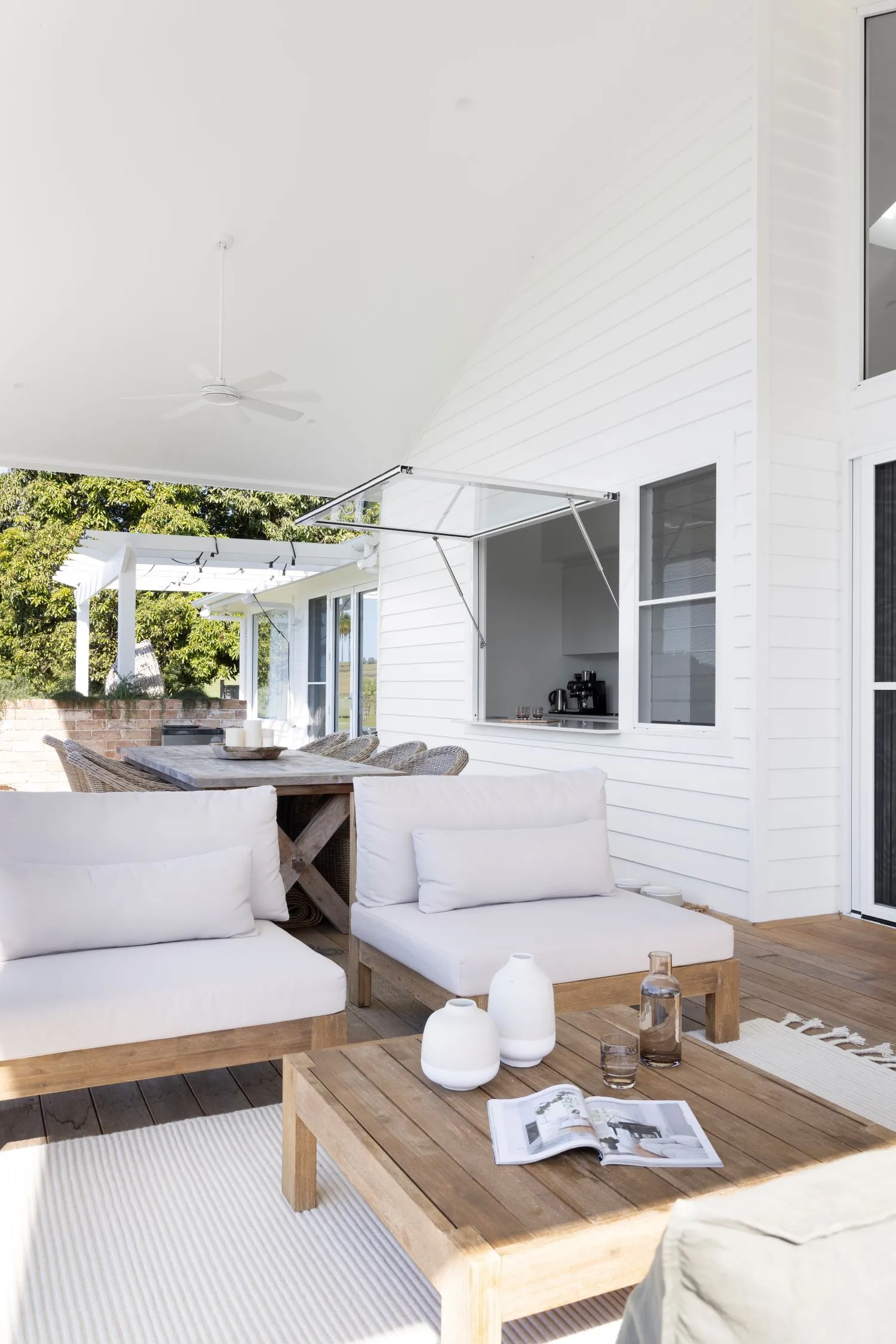
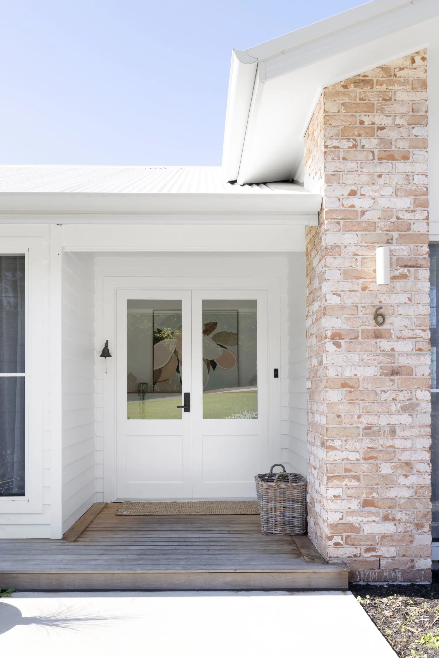
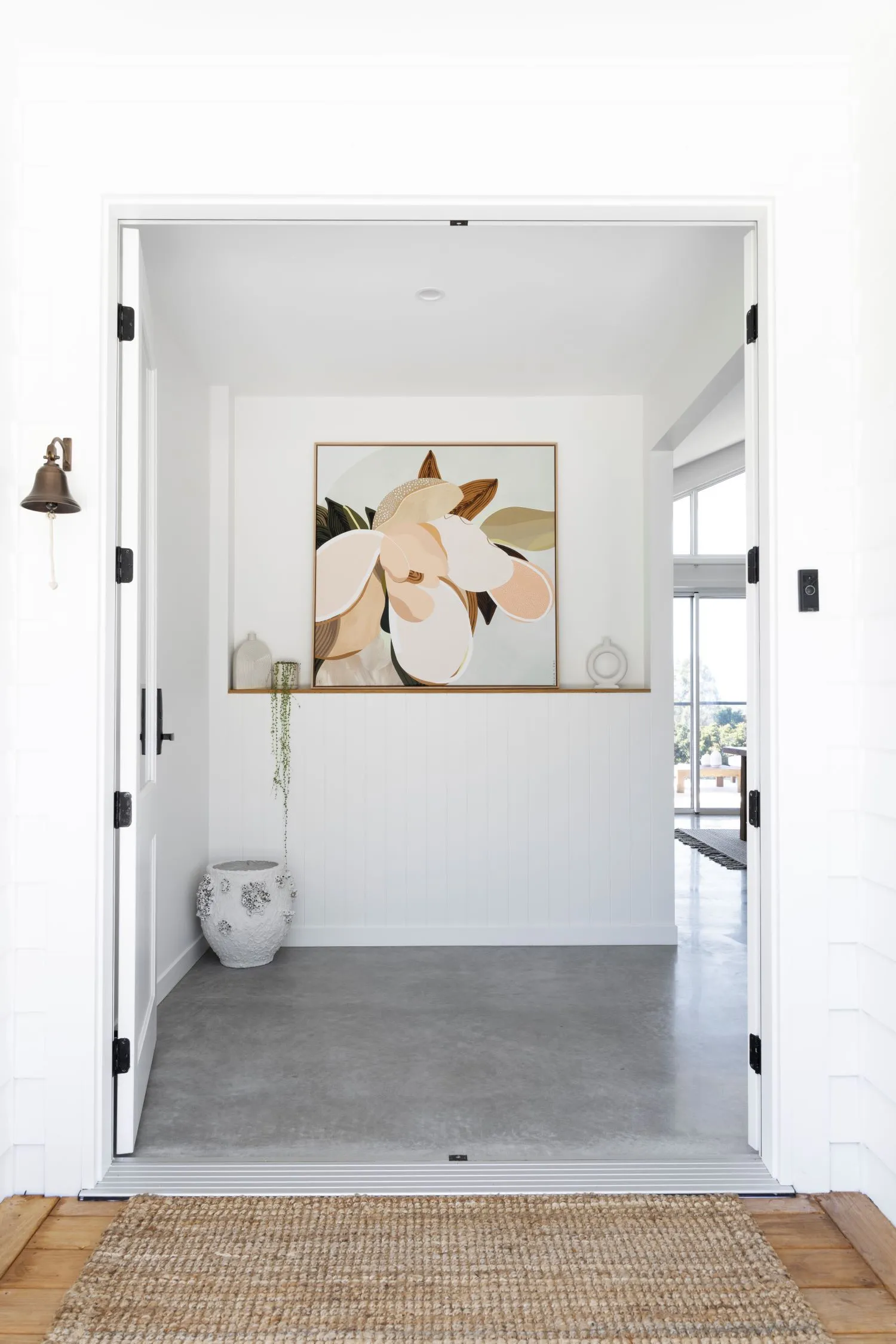
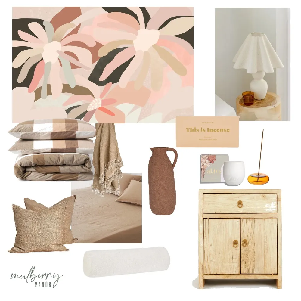
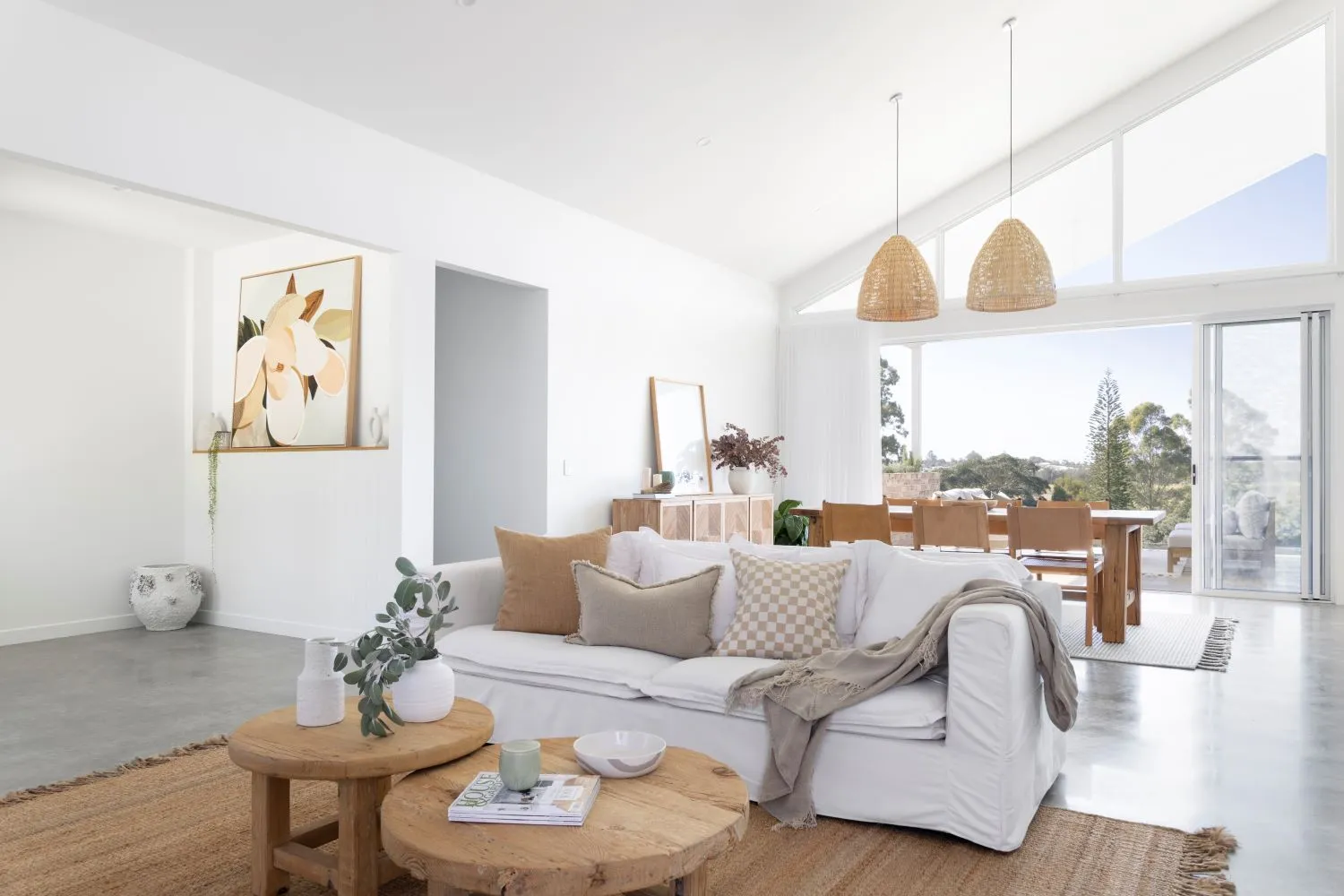
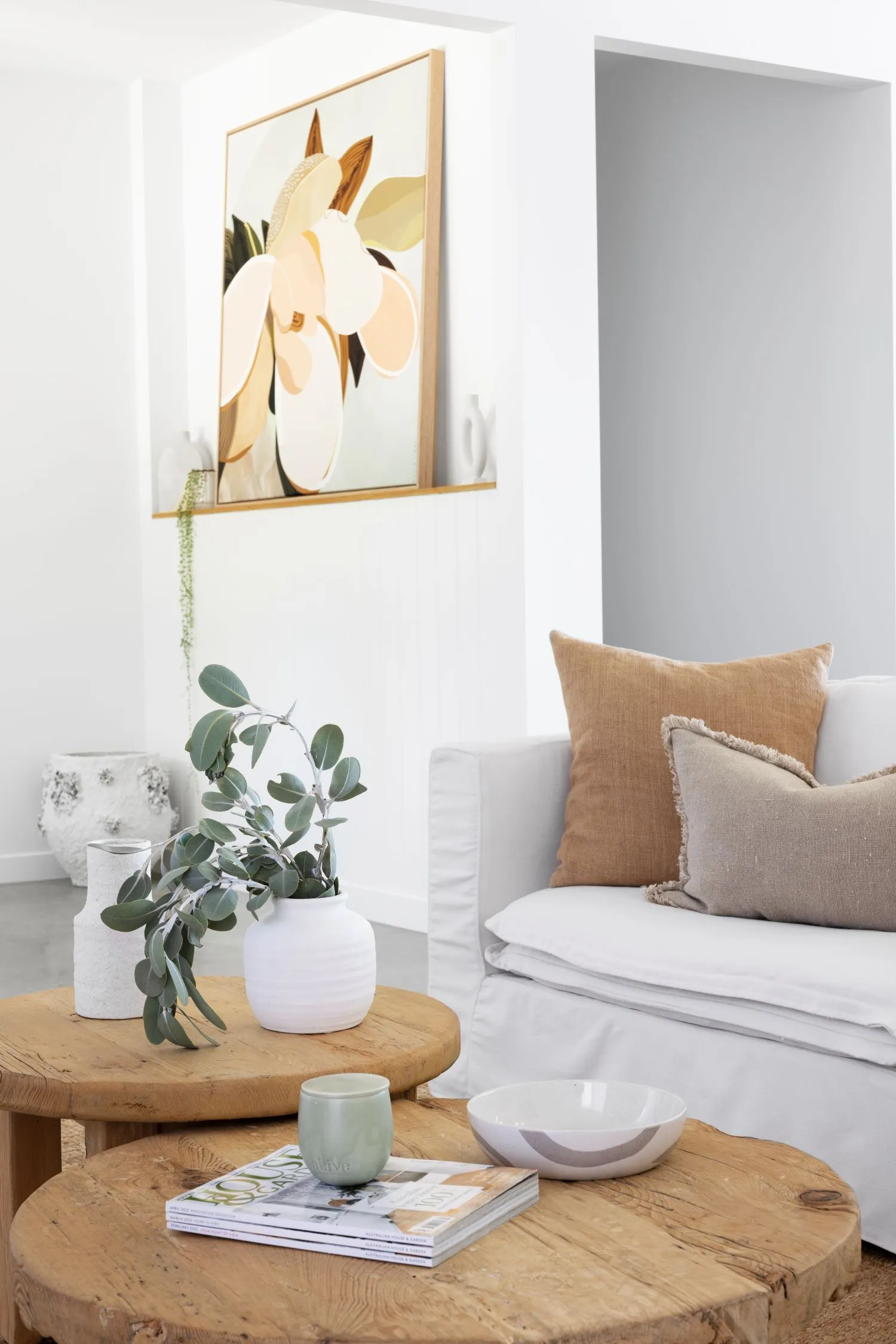
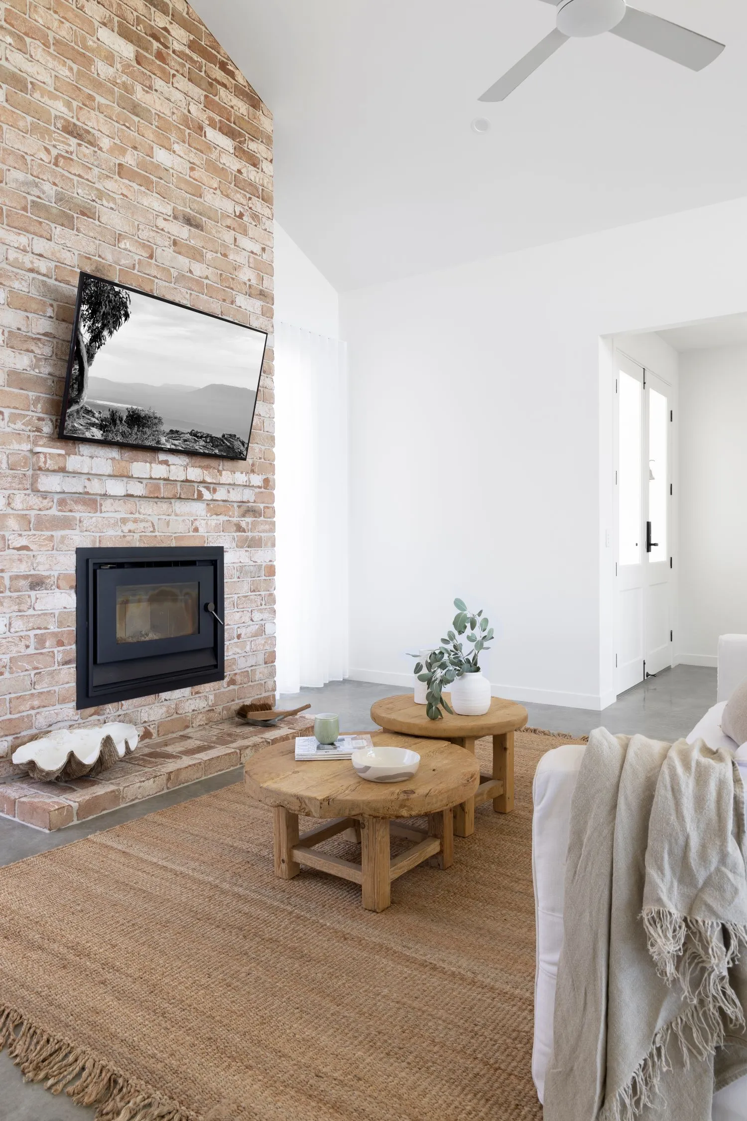
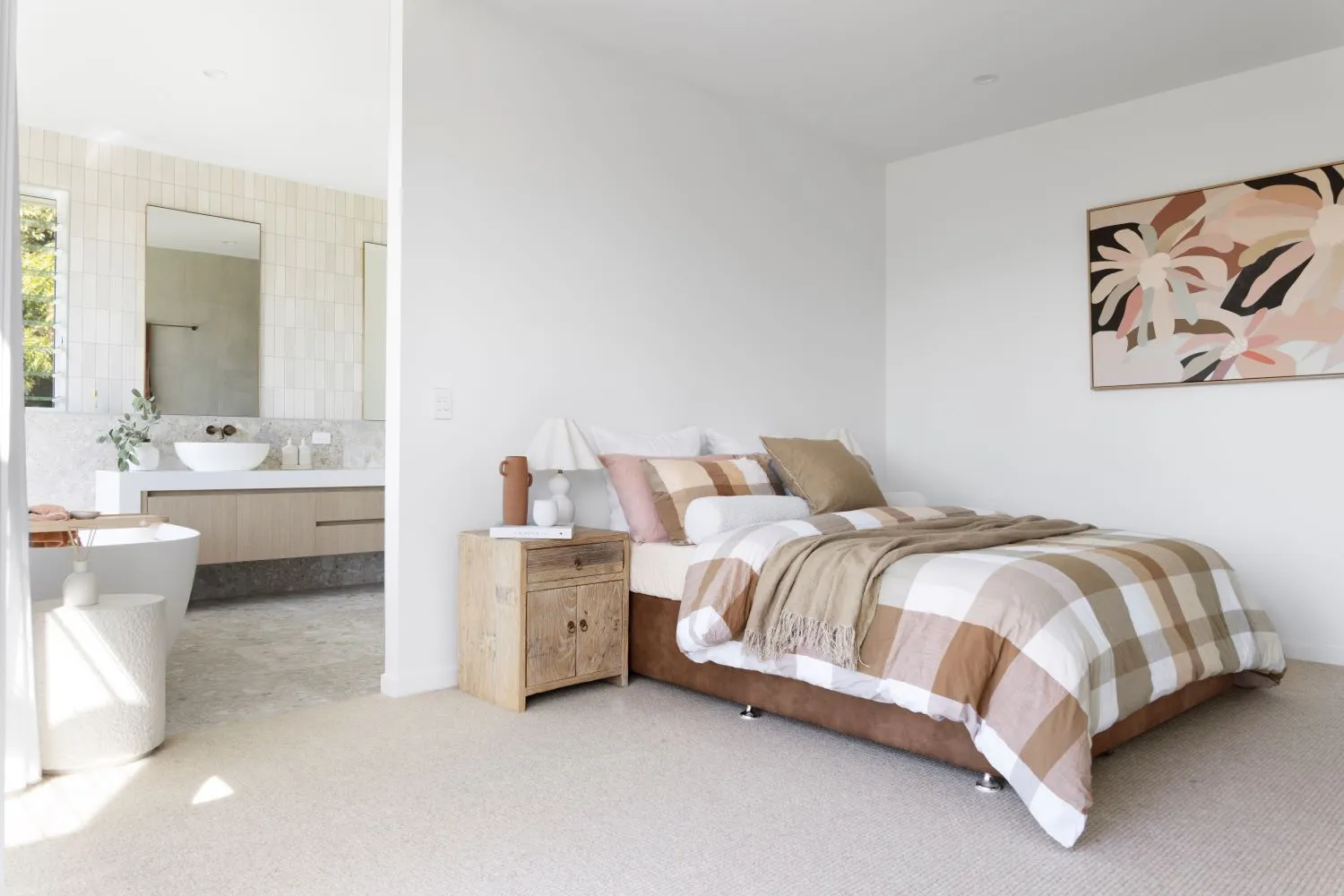
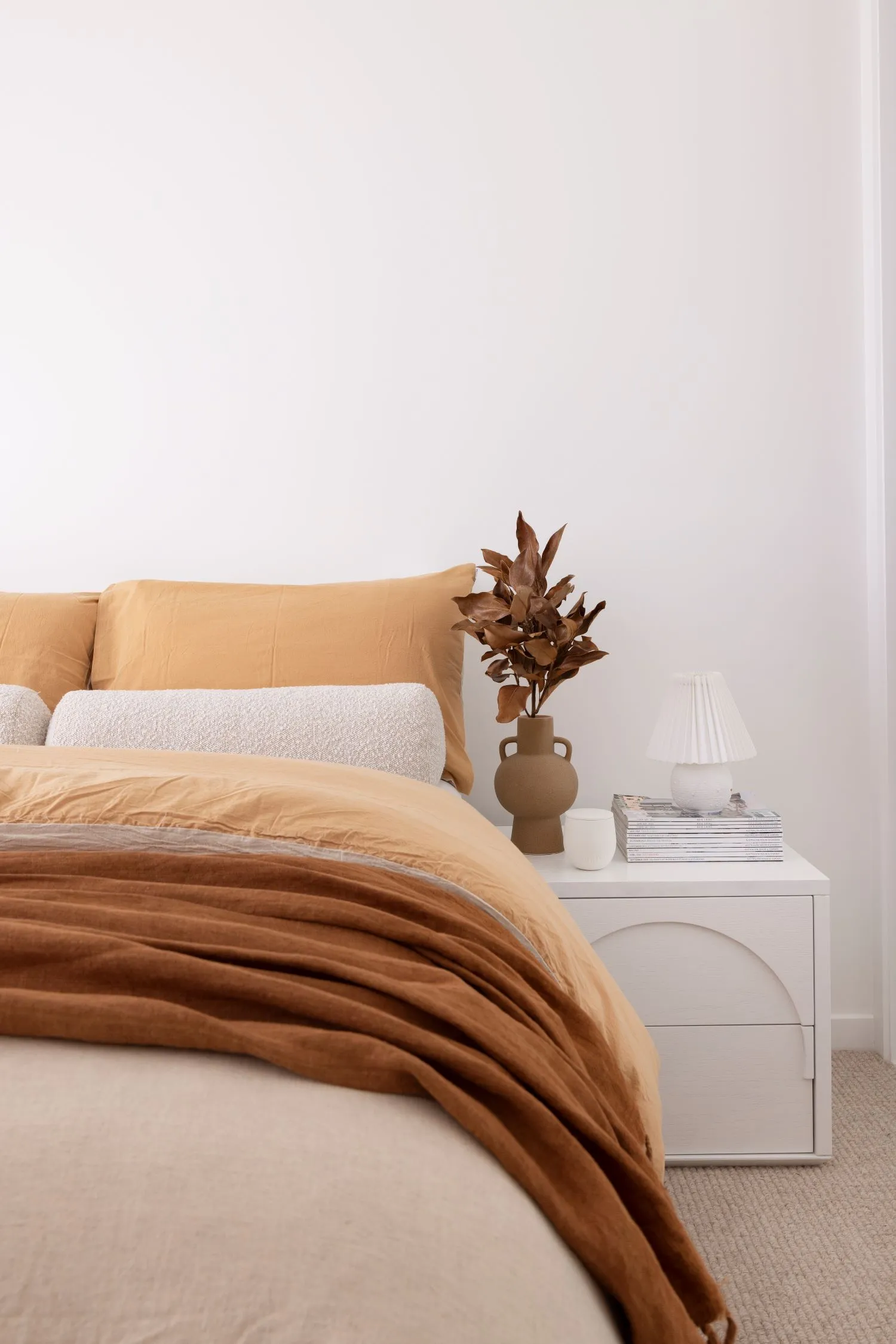
When the owners of Mulberry Manor discovered a hand painted ‘for sale’ sign situated on a vacant block, they knew they had found their new home. The homeowners opted for an Australian coastal style build with a touch of organic accents throughout – think soft whites, light filled spaces and calming green cabinetry. The build draws inspiration from what the owners know and love, which was brought to life by Ausmar Homes. To add the finishing touches to this gorgeous coastal home, styling and furniture pieces such as a raw timber coffee table duo and terracotta bed furnishings were added throughout.
We sat down with homeowner Kate, to find out which aspects were non-negotiables and why the home was named, ‘Mulberry Manor’.
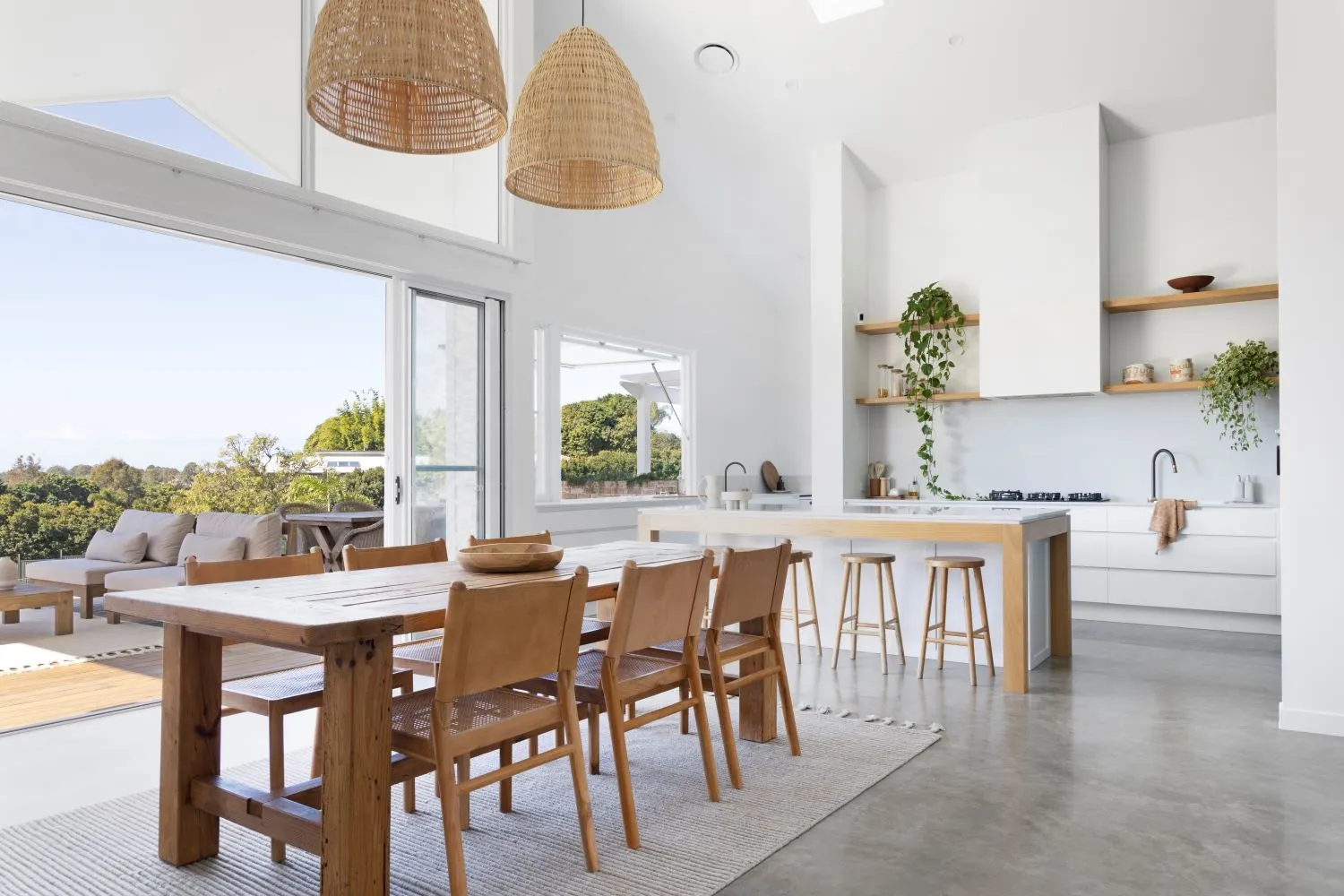
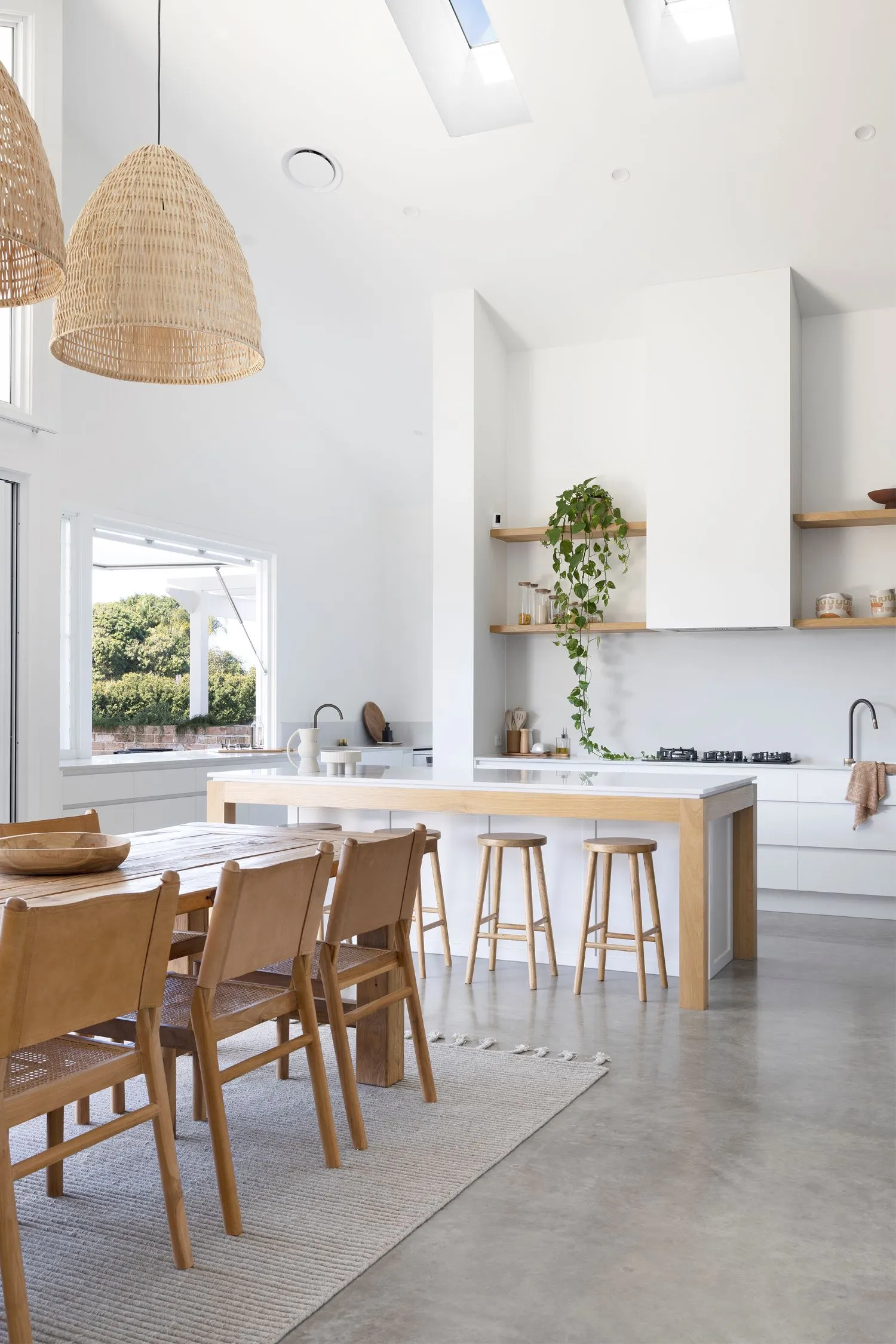
Congratulations on creating such a beautiful home. How did this project begin?
Thank you so much, we love it and feel extremely grateful. We were actually really lucky; we had been chatting about selling our home and building again but we really wanted more space. Josh has five boys, and we have two beautiful beagles, so space was really important for us. We went for a drive around the area (which we love) and literally stumbled upon the block with a tiny hand painted ‘for sale by owner’ sign – we called him immediately!
Where does the name ‘Mulberry Manor’ come from?
One of the attractions for us with the block was it only had one tree on it when we started building, a beautiful 30+ year old mulberry tree, so it felt really fitting being able to name our home after this.
Did you design this project? If so, do you have a background in interior design?
We worked with the drafting team from Ausmar Homes to come up with the design, explained our needs and wants and it evolved from there. The colours are all Josh and I though, and I wish I had a background in interiors – it would make my decision making a lot easier.
How would you describe the style of your home? How did you decide upon this style?
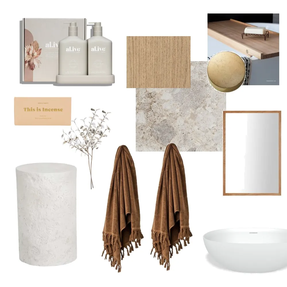
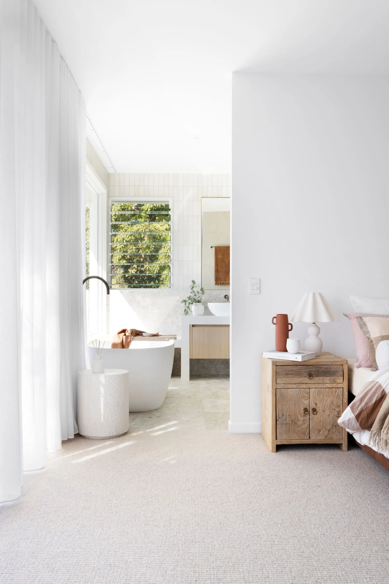
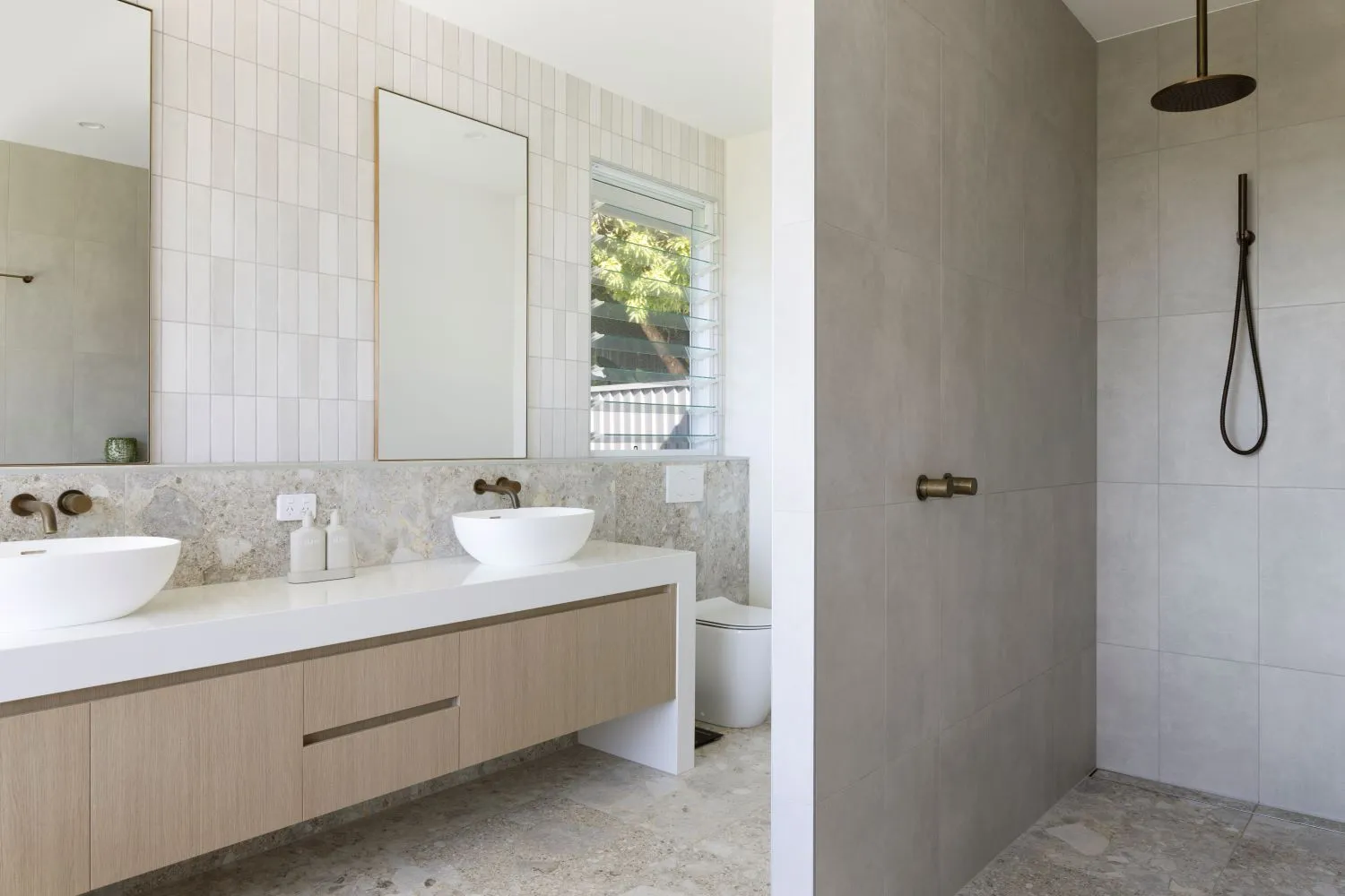
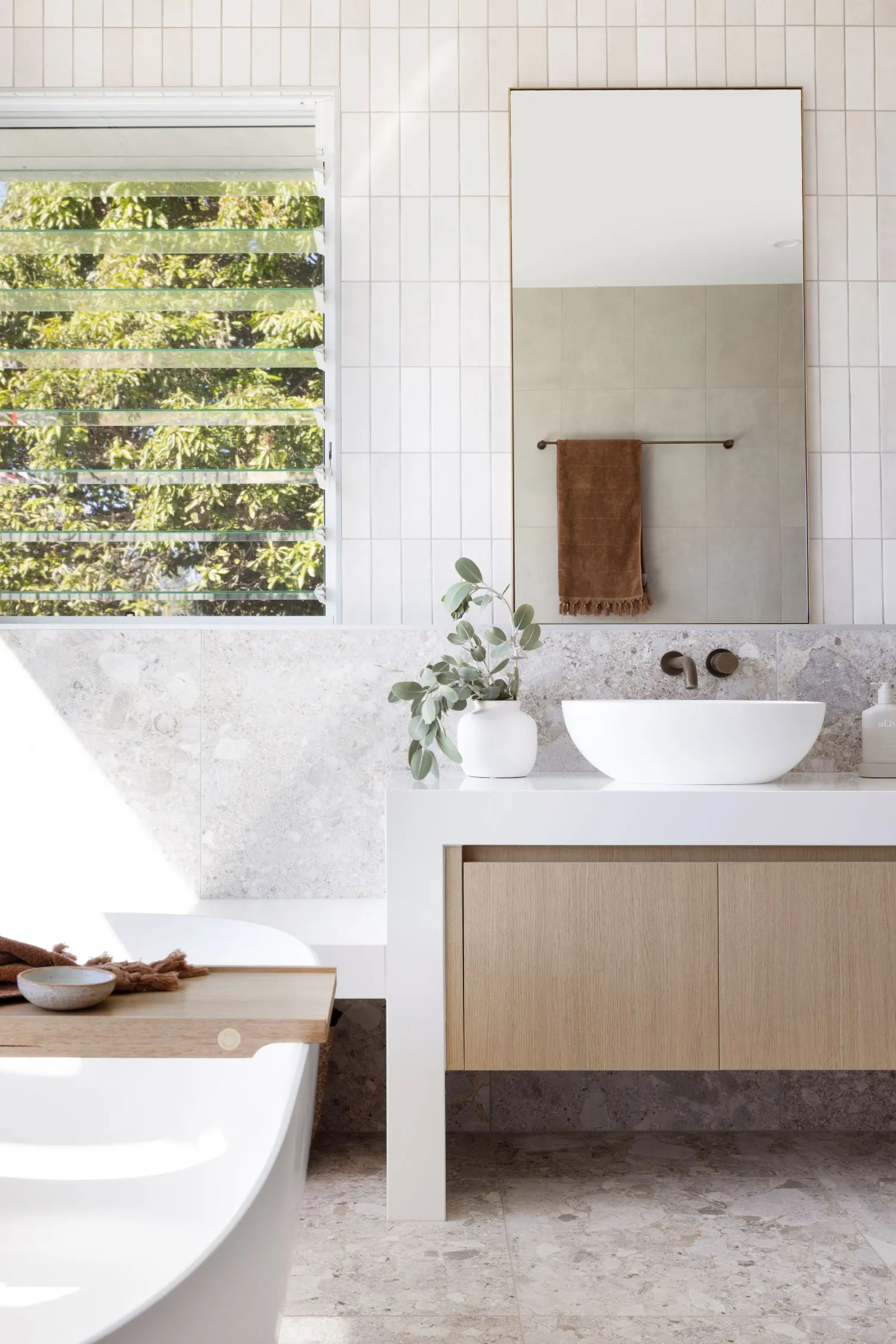
I like to think of it as Australian Coastal and a little organic. The green features throughout the home are very Australian in my eyes, however the exterior brings in those coastal elements that we know and love. The bathroom selections are more organic for me, with lots of texture and very calming tones.
Where did you draw inspiration from for your home?
The exterior feels very Three Birds Renovations, Bonnie in particular to me, however I drew a lot of the interior inspiration from designers like Carlene Duffy from Cedar and Suede and Kate Walker; I love their use of colour within the home.
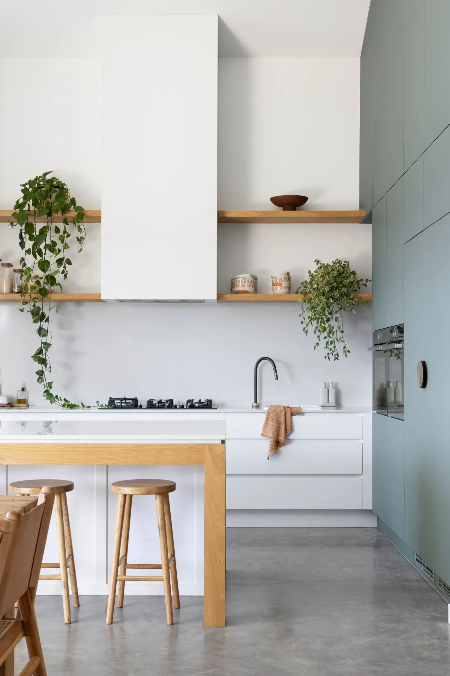
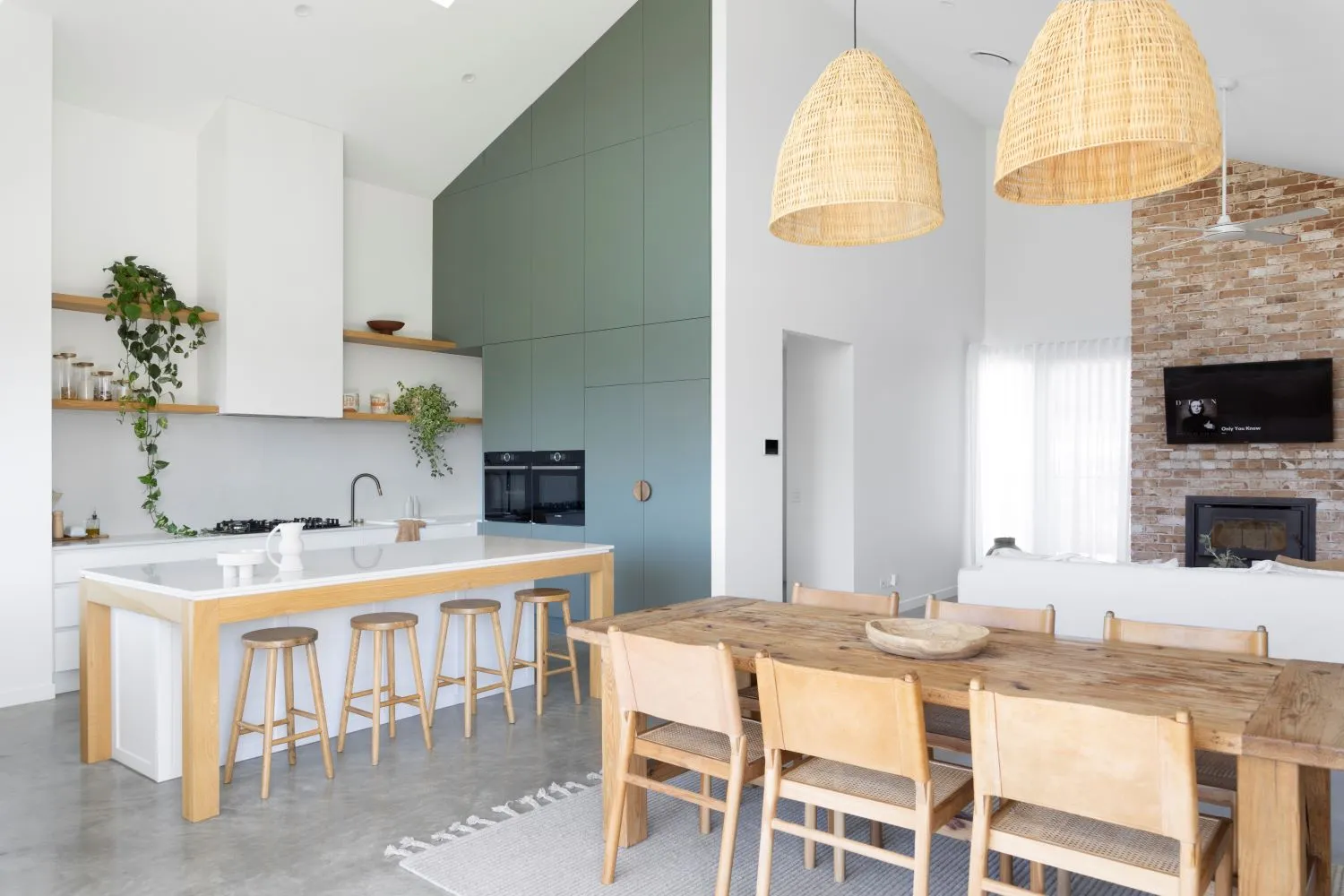
We love the green cabinetry in the kitchen. How did this come to be?
This was one of the first selections I made, it was love at first sight. The Laminex AbsoluteMatte in ‘Green Slate’ is honestly one of my favourite selections in our home. It creates such a calming feel to the kitchen and the texture of AbsoluteMatte is beautiful.
What were some of your non-negotiables when building the home?
- Capturing the outlook from as many spaces as possible.
- No glass in the showers - a game changer when it comes to cleaning.
- High ceilings in the kitchen, dining and living.
- No butler’s pantry – we’ve found we end up just having more clutter, so we wanted an open style pantry to avoid this.

What’s the most-asked question you get on Instagram about this project?
What paint colour did you use? Dulux Snowy Mountains Quarter – internal and external.
What were some of the main brands and suppliers that you used throughout?
- Reece Bathrooms
- Dulux
- Laminex
- Essastone
- AURA – towels
- Ecology – ceramics
- Freedom
- CLO Studios – dining chairs
- TRUECORE Steel - frames and trusses
- Sussex Taps
- National Tiles
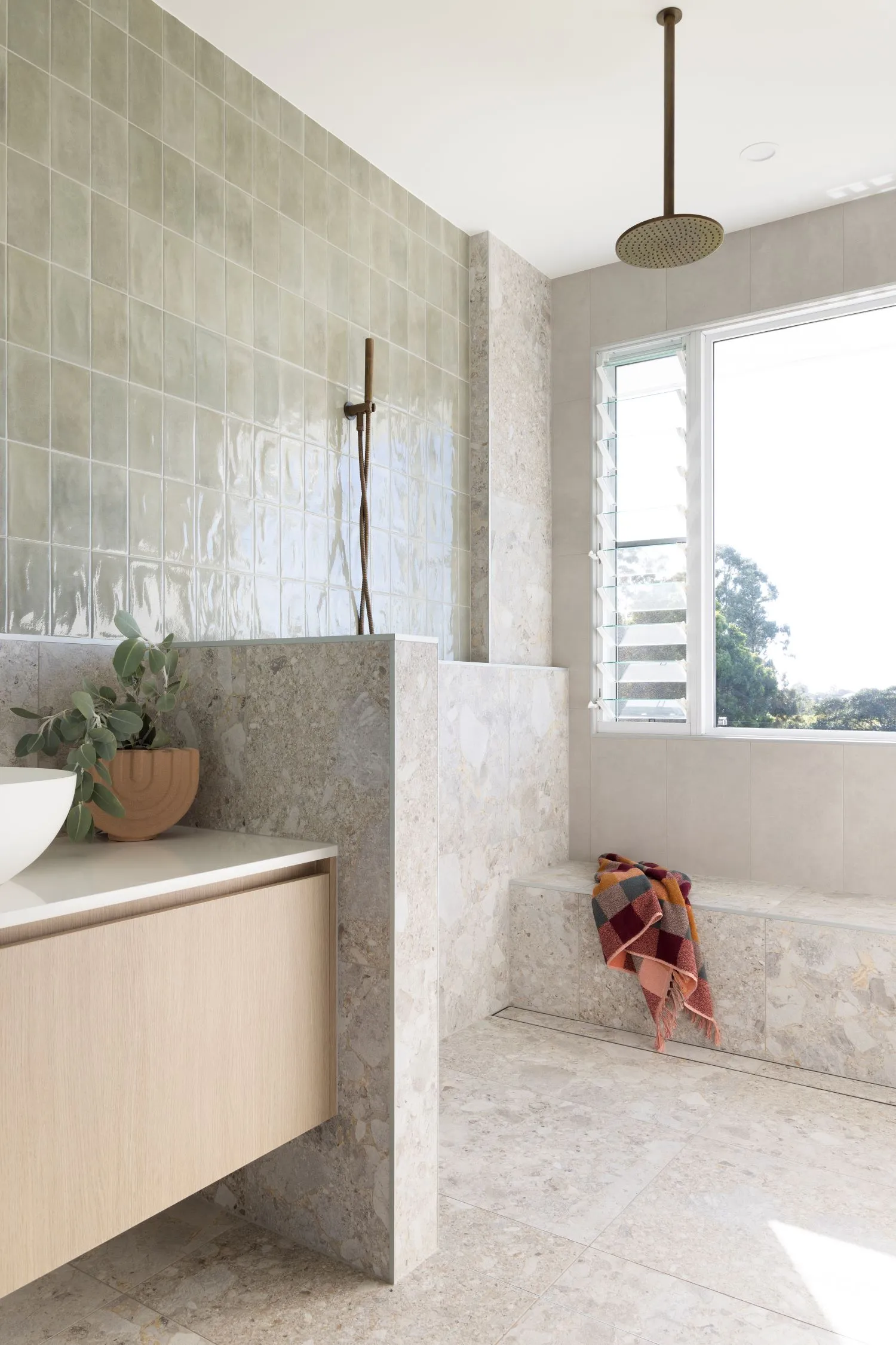
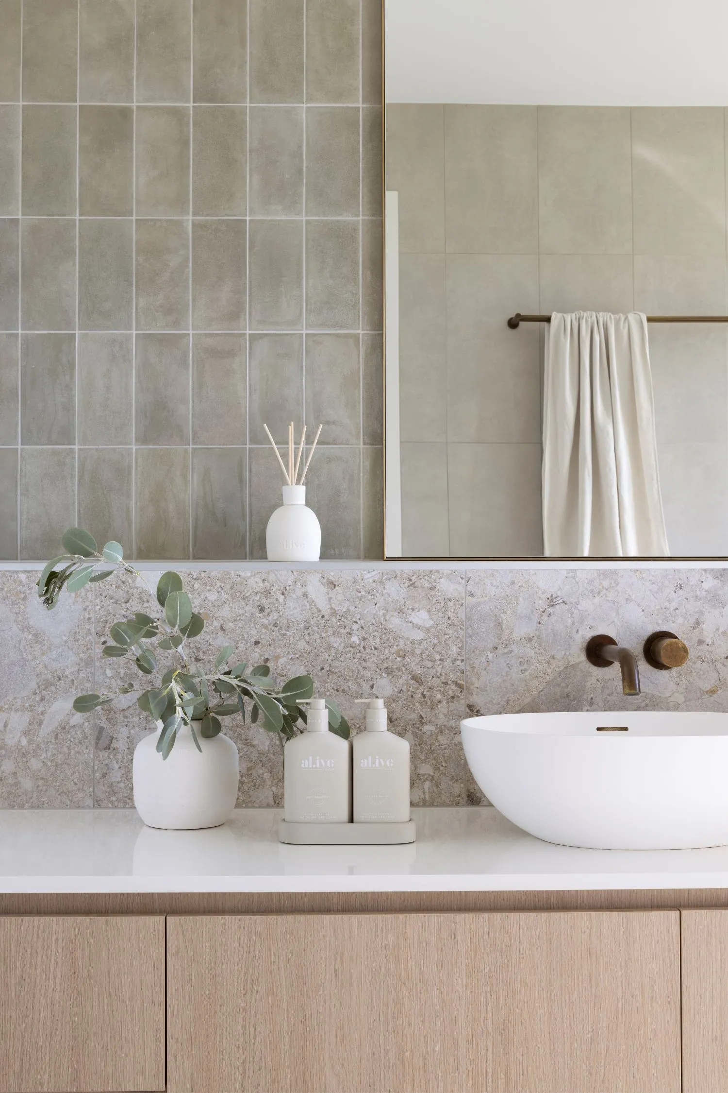
What is your favourite room and feature of the home?
Favourite room - The master suite; this is my happy place. I love coming home after work and washing away the day here. The shower overlooks our yard (and the Mulberry tree) so it’s extremely peaceful.
Favourite feature – Definitely the green wall in the kitchen. Upon entry, you can’t see it, so it creates a WOW factor when people come into the home and I love that.
What advice do you have for those about to embark on a new home build?
Research, research and more research. Find what you love and don’t love and make plenty of notes, gather heaps of inspiration and always go with your gut. Plenty of people weren’t sold on the idea of a green kitchen (or bathroom) but we absolutely love it!
