The Latest
Designer Tips for Creating Your Dream Facade
In Partnership With: James Hardie
Image Credit: James Hardie
Creating a design for your facade is equally as important as designing your interior. While so many people focus on getting the design of their interior perfect, they often forget just how important it is to get the design of their facade right too. After all, the facade of your home is the first thing people see. In fact, in our opinion, the facade sets the tone for your entire home and has a heavy influence on the style your interior will take. However, the problem is that a lot of people just don’t know where to start when it comes to designing their facade or know what materials they should be using. The key to designing your dream facade is knowing what style facade you like and the different elements that go into creating that look. And of course, creating a mood board is the perfect starting point when planning and designing your dream facade.
On that note, we recently welcomed James Hardie to Style Sourcebook. James Hardie is one of the leading suppliers when it comes to exterior cladding solutions and is the brand who a lot of trusted builders, designers and renovators turn to when it comes to choosing the materials that go into their projects. Below, we explore some of our favourite features of James Hardie’s range of products and how you can take inspiration from their different facade looks when creating your dream facade.
Durable & low maintenance products
Unlike a lot of building materials that look great for the first few years after installation and then start to deteriorate and weather over time, exterior cladding from James Hardie is made from fibre cement. Without getting too technical on you, fibre cement is a mixture of cement, water, sand, and cellulose fibre – all sourced from sustainably grown pine trees. What does that mean for you? Different to building materials such as timber weatherboards, fibre cement building products will not burn, are resistant to permanent water and termite damage, and when installed as directed, are resistant to rotting and warping. This makes them a great choice of material for your facade if you’re looking for something that is low maintenance and will look good for years to come.
Endless design possibilities
Whether you prefer a charming country farmhouse, or a sleek modern home is more your style, when it comes to designing with James Hardie’s range of products, the possibilities really are endless. James Hardie has an extensive range of products that suit many different looks. From the clean lines and fine texture finish of their new Hardie™ Fine Texture Cladding to the popular weatherboard look achieved with classic Linea™ Weatherboards, they really have covered all bases. And not just that, there are endless colour options when it comes to choosing what colour your facade should be because cladding comes pre-primed and ready to paint - so you can simply paint your cladding in any colour you like.
Interior and exterior application
Whilst nailing the design for your facade is super important, the beauty of James Hardie’s range of products is that you can use them for both your exterior and interior. Their Axon™ Cladding and Hardie™ Groove Lining are the perfect solutions if you’re wanting to add a bit of character and personality to your interior. Another great thing about offering both interior and exterior cladding is that you can create a consistent and cohesive look that continues from the outside-in.
So, now you know why you should consider using James Hardie’s range of products for your renovation or new build but aren’t sure where to start when it comes to choosing what your facade will look like? Well, look no further than the Modern and Hamptons Looks that James Hardie has taken inspiration from. Within the Modern Looks, James Hardie™ has selected five distinct looks: Box Modern, Mid Century Modern, Mixed Cladding, Modern Coastal and Scandi Barn. Under the Hamptons Looks, there are three different looks: Australian Hamptons, Traditional Hamptons, and Contemporary Hamptons. Below, we take a look at the key elements within each look and show how you can translate this when designing your own facade.
MODERN
It’s no secret that Australians love Modern homes. Sleek lines, a contemporary colour palette and a light and airy floor plan are what a lot of us look for when it comes to modern home design. But we know that modern design is often difficult to describe. James Hardie has created their Modern Lookbook to highlight the current trends in modern design, and to help you achieve these looks for yourself.
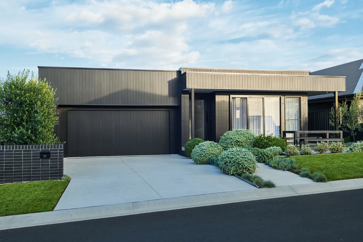
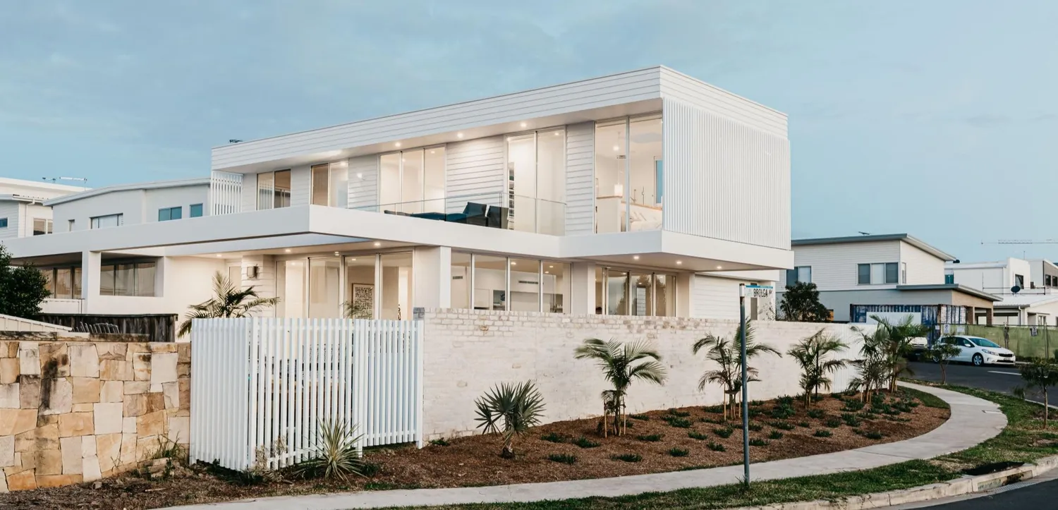
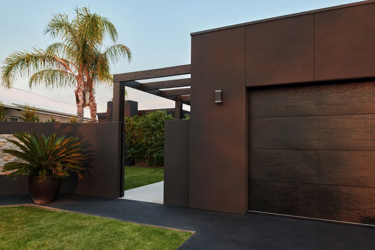
Namely, the Box Modern Look is just that – emphasizing the arrangement of different shaped boxes to create a contemporary home.
Key elements include:
- Roof: A hidden roofline, with parapet walls used to create the illusion of a flat roof.
- A minimum of two distinct boxes, or cubic forms, arranged so that they are offset left to right and front to back to create visual interest.
- Colour palette: An achromatic palette. White colours project and dark colours recede. This means that painting one box white and the other dark grey emphasizes the facade and creates a dramatic effect. The use of white, black and greys are key in creating this look.
- Strong emphasis on cladding and the use of clean and vertical or horizontal lines.
Materials often used: Axon™ Cladding, Hardie™ Fine Texture Cladding
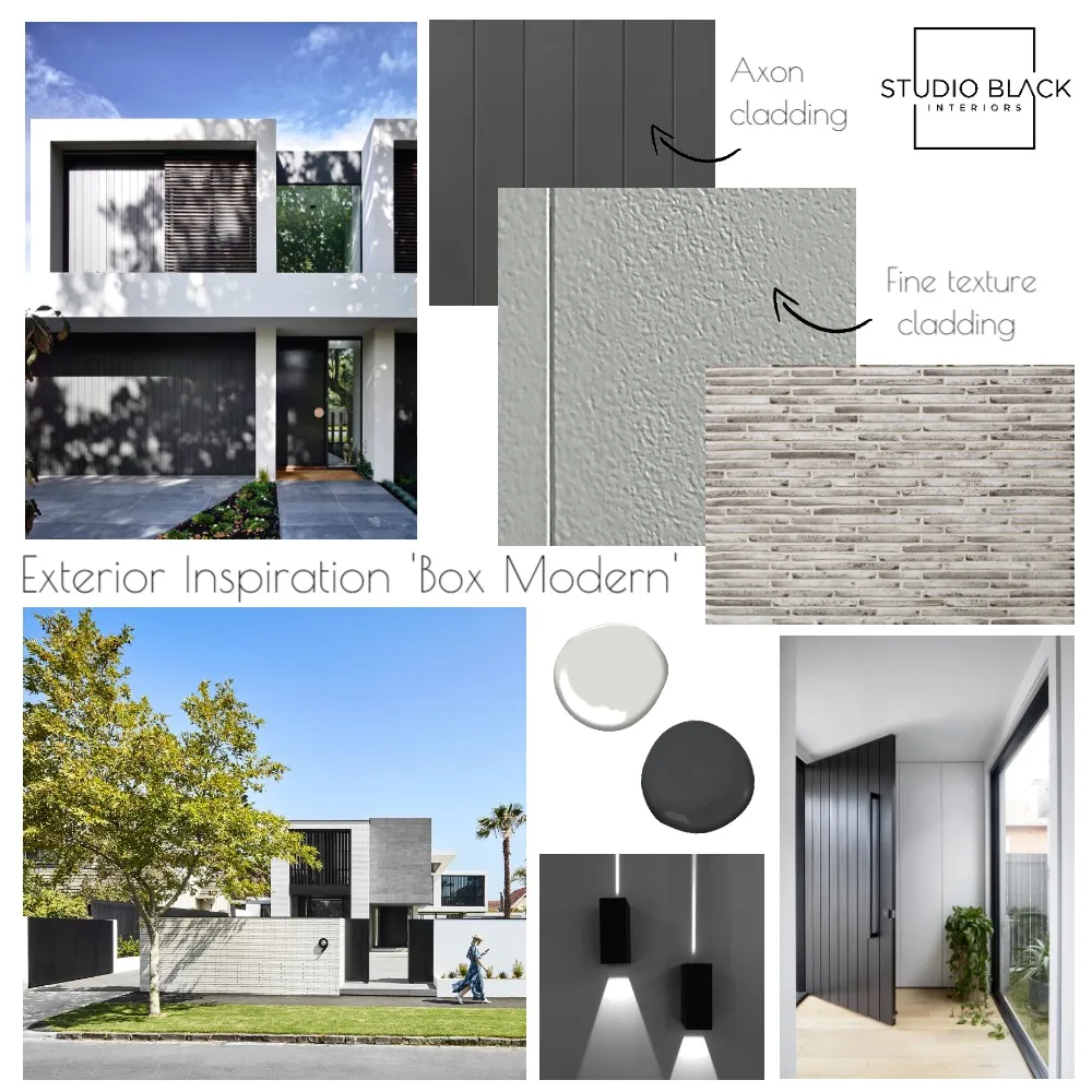 Box Modern mood board designed by Studio Black Interiors. View mood board here
"The box shape is a modern design element used in architecture to create clean lines and strip back design to its purest form. The key elements in creating a box modern facade are to use the clean lines of vertical, horizontal or even panel cladding to distinguish each box shape. Paired with a palette of dark and light colours in tones of black, white and grey, creates a home that has a sophisticated and high-end feel".
- Maria, Studio Black Interiors on creating a 'Box Modern' facade look
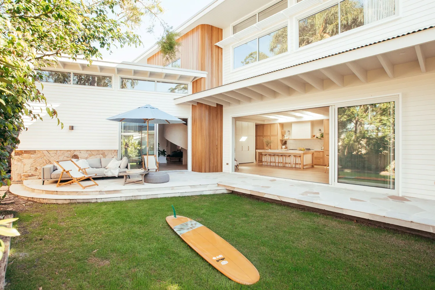
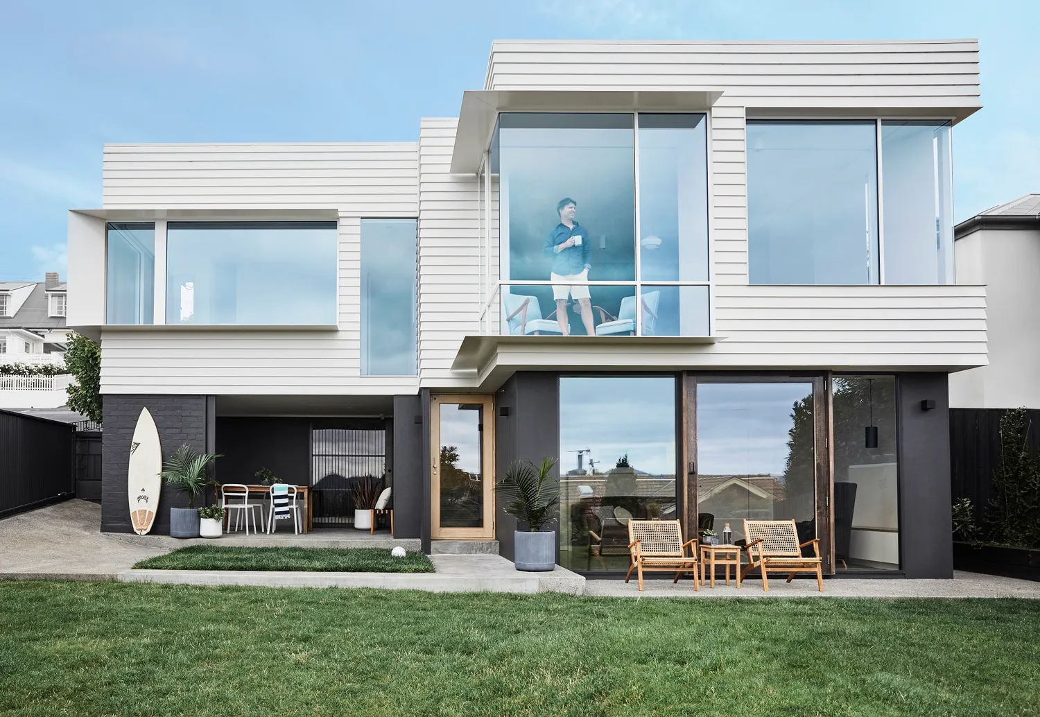
Reflective of Australia’s beach shack history, the Modern Coastal Look takes crisp white weatherboards and combines them with contemporary clean lines. If you love the laid-back luxury vibe and outdoor living, then this is the look for you.
Key elements include:
- Crisp white Linea ™ Weatherboards
- Roof: Flexible roof styles. This look can really work with any roof style that provides a designer look (flat roof, gable roof or skillion roof). The main emphasis is keeping it simple.
- Windows, windows, windows and did we say windows? Invest in large, impressive windows and place them carefully in the facade. This could be large windows looking out onto the pool area or a round window in your laundry.
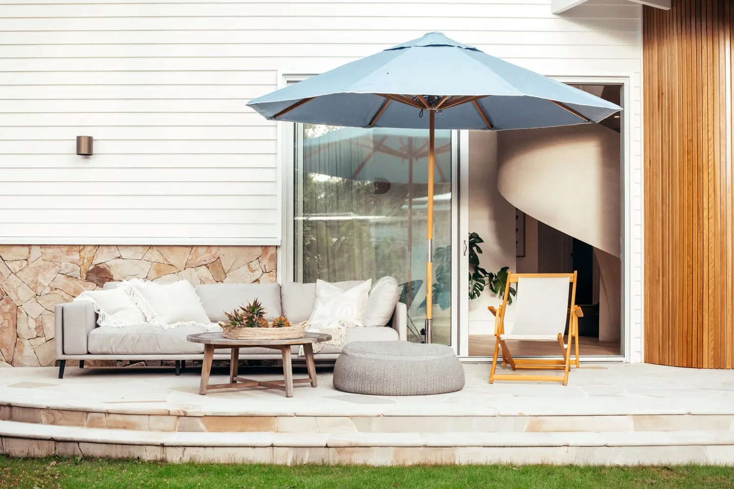
- Embrace the relaxed coastal styling. Think wide stacking doors, deck chairs, outdoor umbrellas, neutral and natural textures, and lots of outdoor plants.
- Materials often used: Linea ™ Weatherboards, Stria™ Cladding, Axent™ Trim
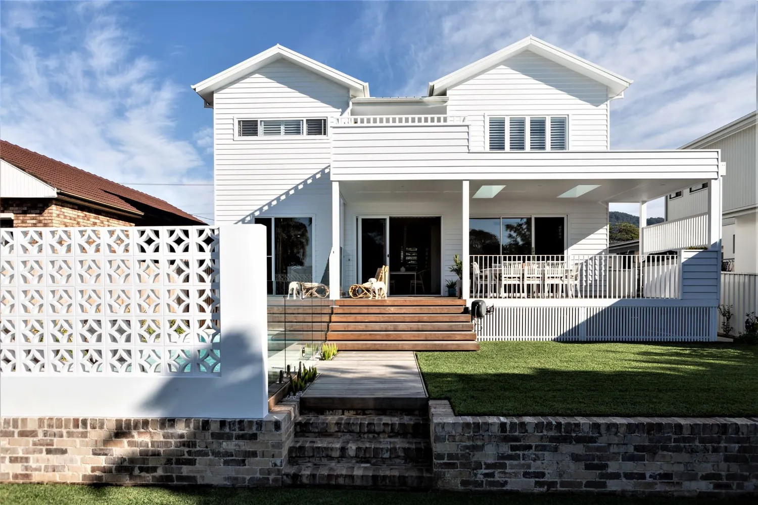
“When creating a modern coastal facade for our clients we always start with the main exterior element. This would be the weatherboards as it covers the entirety of the home. Another tip is to mix the weatherboards with timber, bricks, natural stone and tiles. It is important to mix textures when creating a modern coastal design. And of course, you can never go wrong when you add plants to bring it all together.”
- Bone + Blanc, Interior Design Studio on creating a 'Modern Coastal' facade look
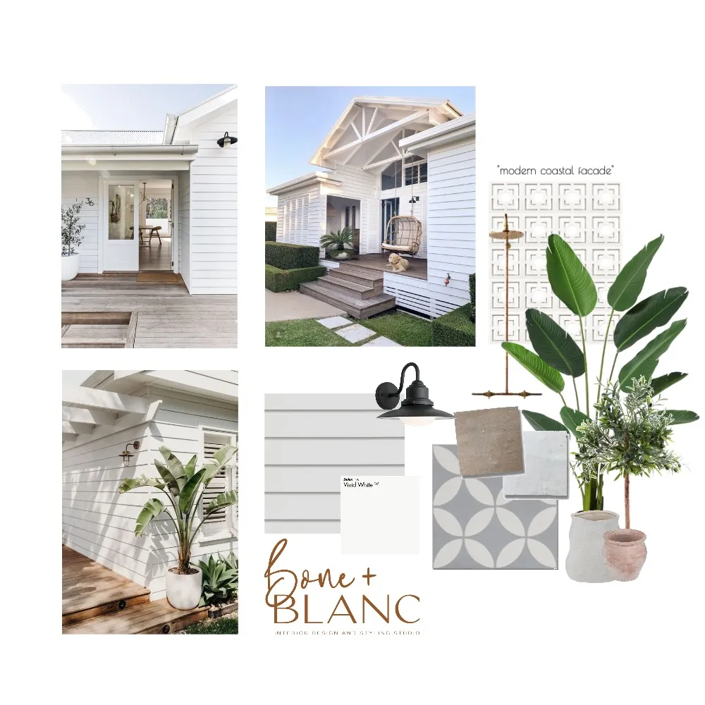 Modern Coastal mood board designed by @boneandblanc. View mood board here
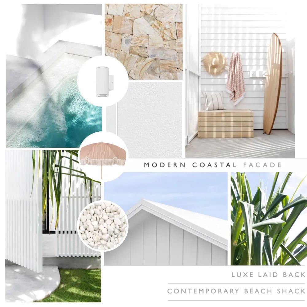 Modern Coastal mood board designed by @villastyling. View mood board here
"The Modern Coastal look encourages an indoor-outdoor lifestyle. Relaxed coastal styling aids in creating a strong connection between your house and a garden, private courtyard or deck."
- James Hardie
We have certainly seen a rise in the modern farmhouse and barn-style homes in Australia. The Scandi Barn Look is often a favourite look for people who love this style. From their vaulted ceilings, opening plan living, and bold street appeal, the Scandi Barn Look encourages simplicity, minimalism with a touch of Scandinavian influence.
Key elements include:
- Roof: A steeply pitched gable roof. This is generally set fairly high, with a pitch of 35 to 45 degrees. Corrugated steel sheets are preferred over tiles.
- A pure barn shape is a must for this style. Imagine asking a child to draw a picture of a barn – this simplicity is what the facade should look like.
- Clean lines with the addition of timber to add that Scandinavian feel
- Open and airy floor plan with the addition of skylights, light timber floors throughout and neutral and natural materials.
- Materials often used: Axon™ Cladding, Linea ™ Weatherboards

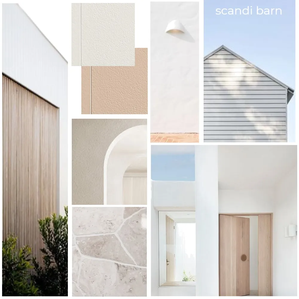 Scandi Barn mood board designed by @the_stables_. View mood board here
"Scandi Barn homes are cropping up all over Australia. The modern farmhouse aesthetic is ideal for those who love bold design and simplicity".
- James Hardie
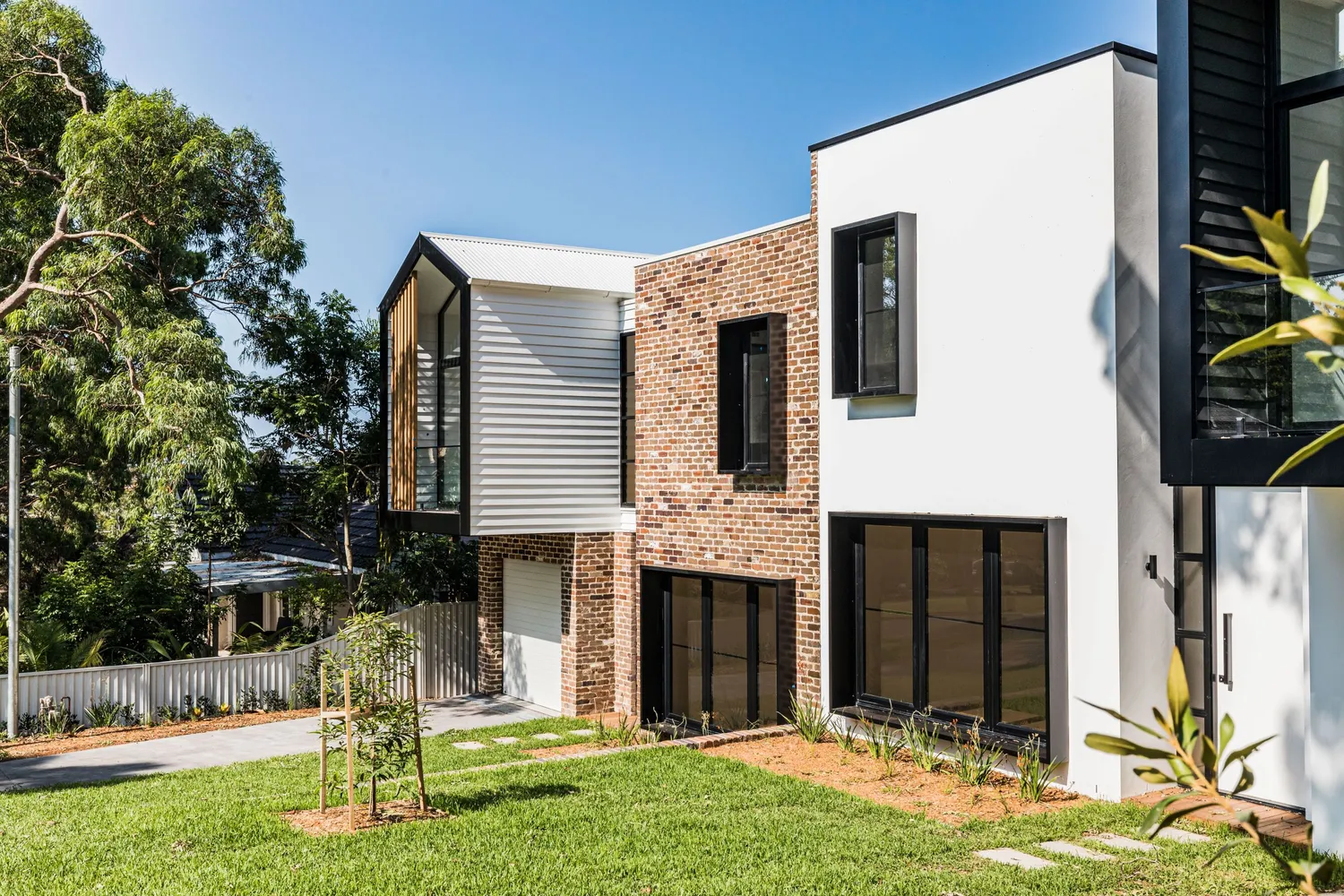
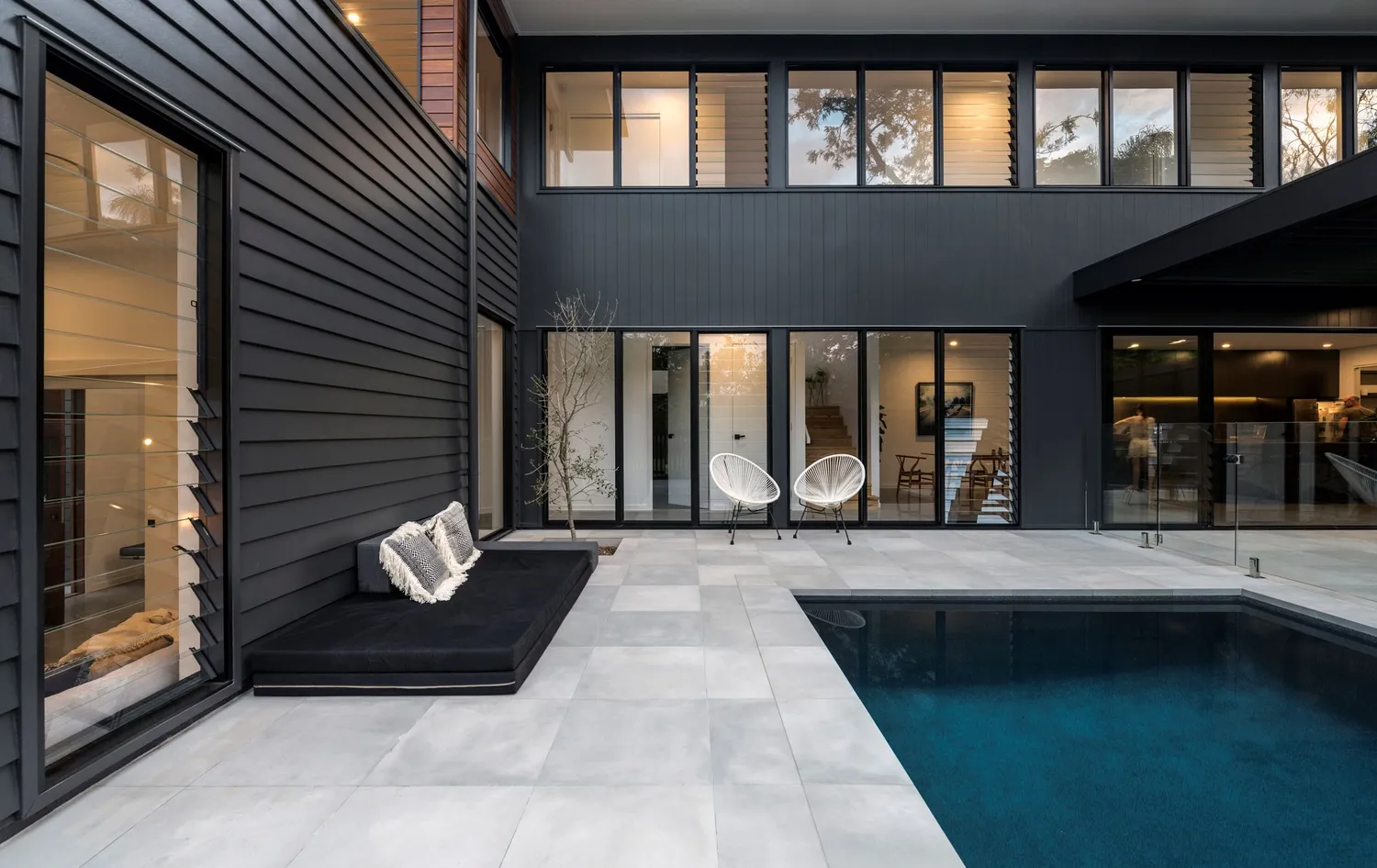
Mixing, matching, and layering different materials is what this look is all about. Incorporating different styles of cladding creates an interesting and unique look. This look is all about making the facade your own and putting your own spin on it.
Key elements include:
- Roof: A hidden roofline. A flat or skillion roof is a must. This is so the roof doesn’t clash with the mixture of cladding materials chosen.
- Mix two or more different cladding styles. This could look like mixing weatherboards with vertical joint cladding and then adding Hardie™ Fine
- Texture Cladding to the areas where you want the other cladding to be the main feature.
- Carefully placed windows. For this look we’d generally suggest placing the windows at the same height to create a contemporary and sleek aesthetic.
- Colour palette: It’s best to stick with a monochrome colour palette as the mixture of different cladding material is going to be the hero. Finish off the last 10% of your colour palette with timber tones or an unexpected pop of colour.
- Materials often used: Matrix™ Cladding, Hardie™ Fine Texture Cladding, Stria™ Cladding, Linea™ Weatherboards
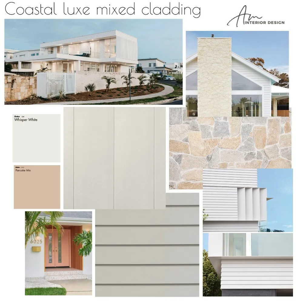 Mixed Cladding Facade mood board designed by @am_interiordesign_studio. View mood board here.
“To achieve a coastal luxe mixed cladding look, I recommend using a blend of James Hardie Linea™ weatherboards, Matrix™ and Axon™ cladding in whisper white. The softness of whisper white, offset by texture of stone and timber, plus a feature doorway compliments Jamie’s Hardies range and completes the final look”.
- Ashlee, AM Interior Design Studio on creating a 'Mixed Cladding' facade look
This look takes inspiration from the 1930’s through to the 1970’s. One of the main principles of this look is “form follows function”, which means that the purpose often comes before the design. Creating a home that is practical should be at the forefront of your mind when creating this look.
Key elements include:
- Roof: Flat or gently sloping skillion or gable roofline.
- Exposed angular structures or beams.
- An abundance of floor to ceiling windows. Allowing immense amounts of natural light into the home is a big factor for this style.
- Open plan living where the dining, living and kitchen combine into one.
- Materials often used: Hardie™ Fine Texture Cladding, Axon™ Cladding
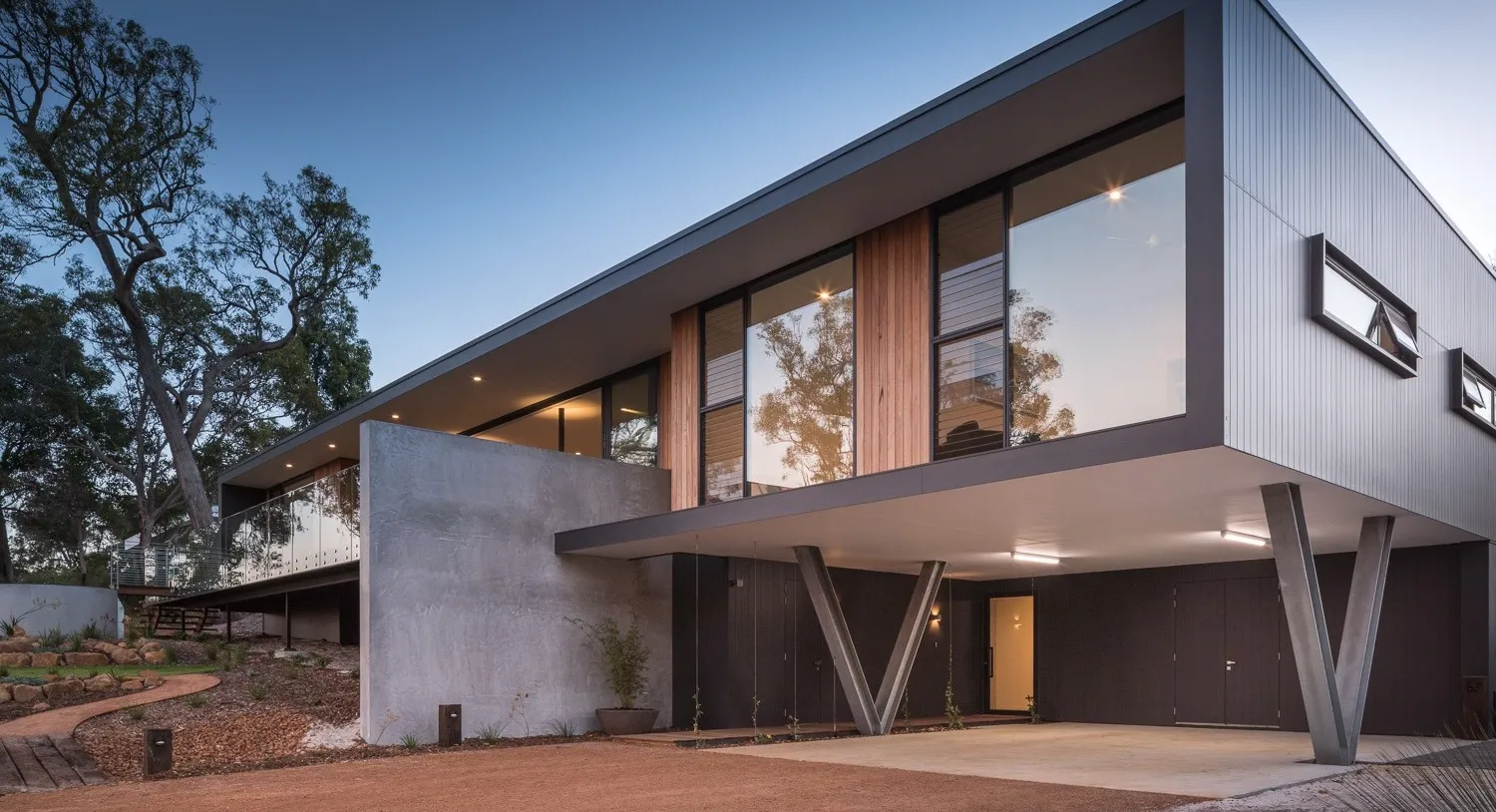
“There are a few sure ways to achieve a mid-century facade. Try a pop of bold colour on the front door, and sticking to clean lines and geometric shapes just as you would with mid-century interiors. Landscaping should be minimal. Think plants indigenous to your area, and a focus on marrying the interior with the exterior. Connecting with nature is a huge MCM philosophy, so make sure to really showcase your garden and utilise those large architectural features like floor-to-ceiling windows to enjoy the view. The earthy hues, linear weatherboard, timbers, stone and textured cladding used in this colour palette reflect the handcrafted, organic nature of mid-century modern design.”
- Oleander and Finch, Interior Designer on creating a 'Mid Century Modern' facade look
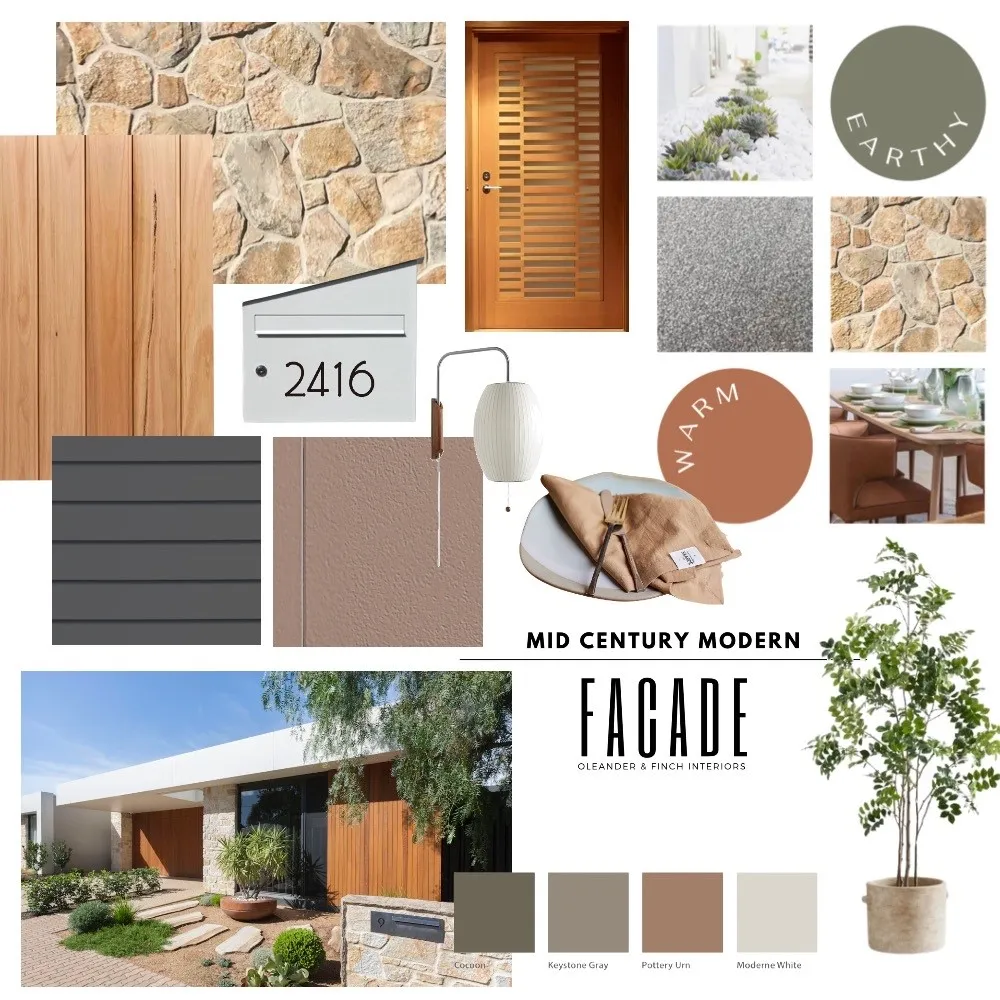 Mid Century Modern mood board designed by @oleander_and_finch. View mood board here
To discover more of these modern facade styles, download James Hardie's Modern Lookbook here.
HAMPTONS
The devil is in the details when it comes to creating a Hamptons look. Hamptons homes are often designed with family in mind and the focus is often on creating somewhere where the family can gather and create conversations. It’s no secret that Australians love a good Hamptons home. The typical indoor/outdoor Australian lifestyle fits into this warm and inviting look. So, what are the key elements of a Hamptons home you ask? A neutral colour palette, light and spacious living areas, natural textures, high ceilings, an emphasis on the kitchen and detail, detail, detail throughout.
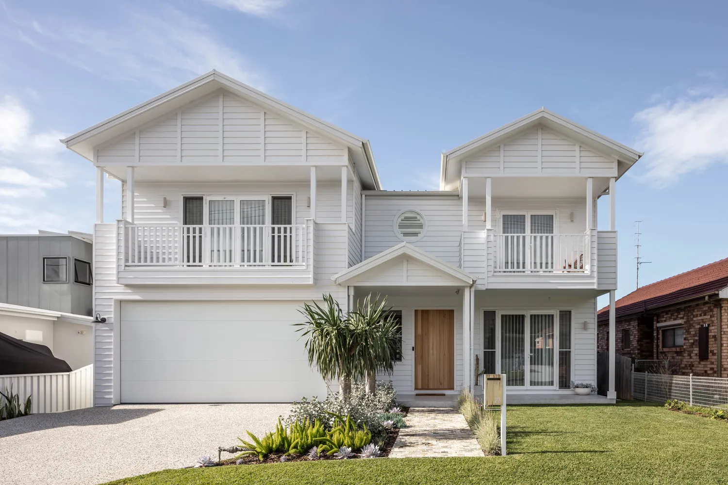
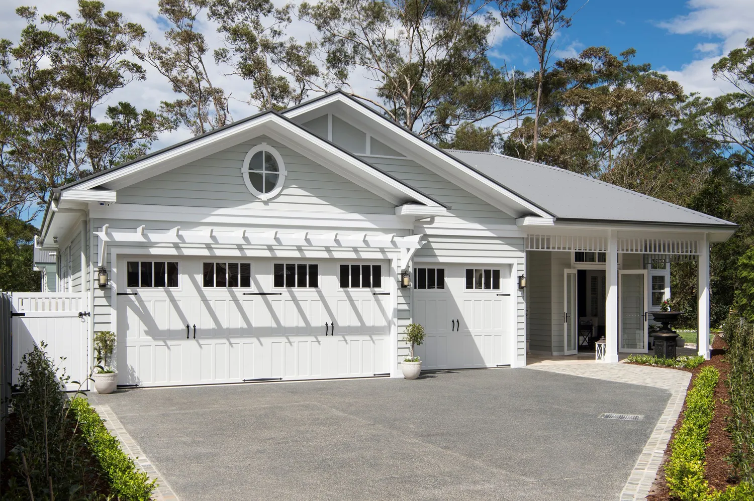
The Australian Hamptons look takes inspiration from its coastal origins but is a bit more down-to-earth than your traditional Hamptons look. Large verandahs to provide protection from that famous Australian sun is a key feature of this look.
Key elements include:
- Roof: A simple roof line with one or two open or Dutch gables. Colorbond steel is often used.
- Colour scheme: Neutral colour for weatherboards (grey is a popular choice) and white trims.
- Basic details. Gable vents, rafter tails and white verandah posts.
- Materials often used: Linea™ Weatherboards in a 180mm profile.
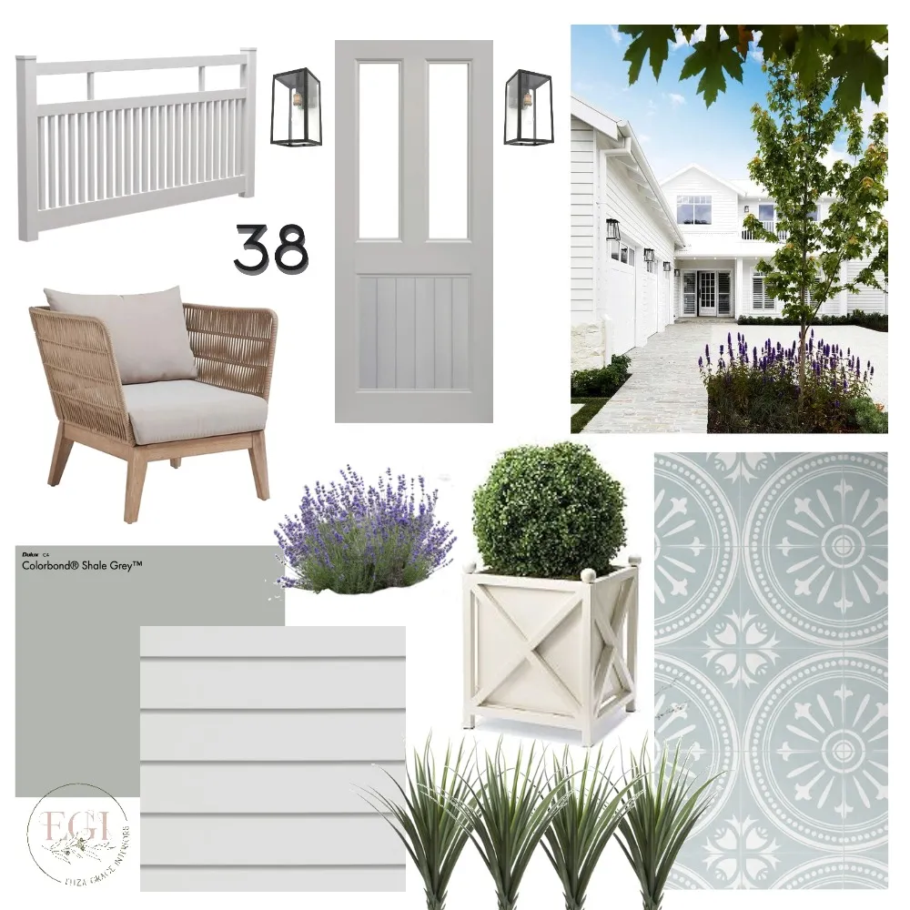 Australian Hamptons mood board designed by @elizagraceinteriors. View mood board here
"The Australian Hamptons Facade is an iconic look that mixes elements of coastal, country and modern design styles in a seamless way. The key to creating this look is to keep your finishes light using colours such as white, off white and light grey. To achieve the Australian Hamptons look it is essential to include elements such as horizontal cladding, encaustic tiles, a large verandah, a traditional front door and plenty of greenery."
- Eliza Grace Interiors on creating a 'Australian Hamptons' facade
As the Hamptons Look becomes more and more mainstreamed in Australia, the Contemporary Hamptons look embraces a bold and more modern look than the Traditional Hamptons. This is often explored through the bold use of contrasting colours and paired back details.
- Roof: Bold roofline with king post trusses with shingle style roof tiles.
- Colour scheme: Confident use of colours – think navy and charcoal. Contrasting colours for trims (i.e. If you opted for white weatherboards then you would go with black trims).
- Pared-back level of detail. Focus is more on form than decoration. There would be no gables or shutters for this look.
- Materials often used: Linea™ Weatherboards or Stria™ Cladding Splayed shiplap boards.
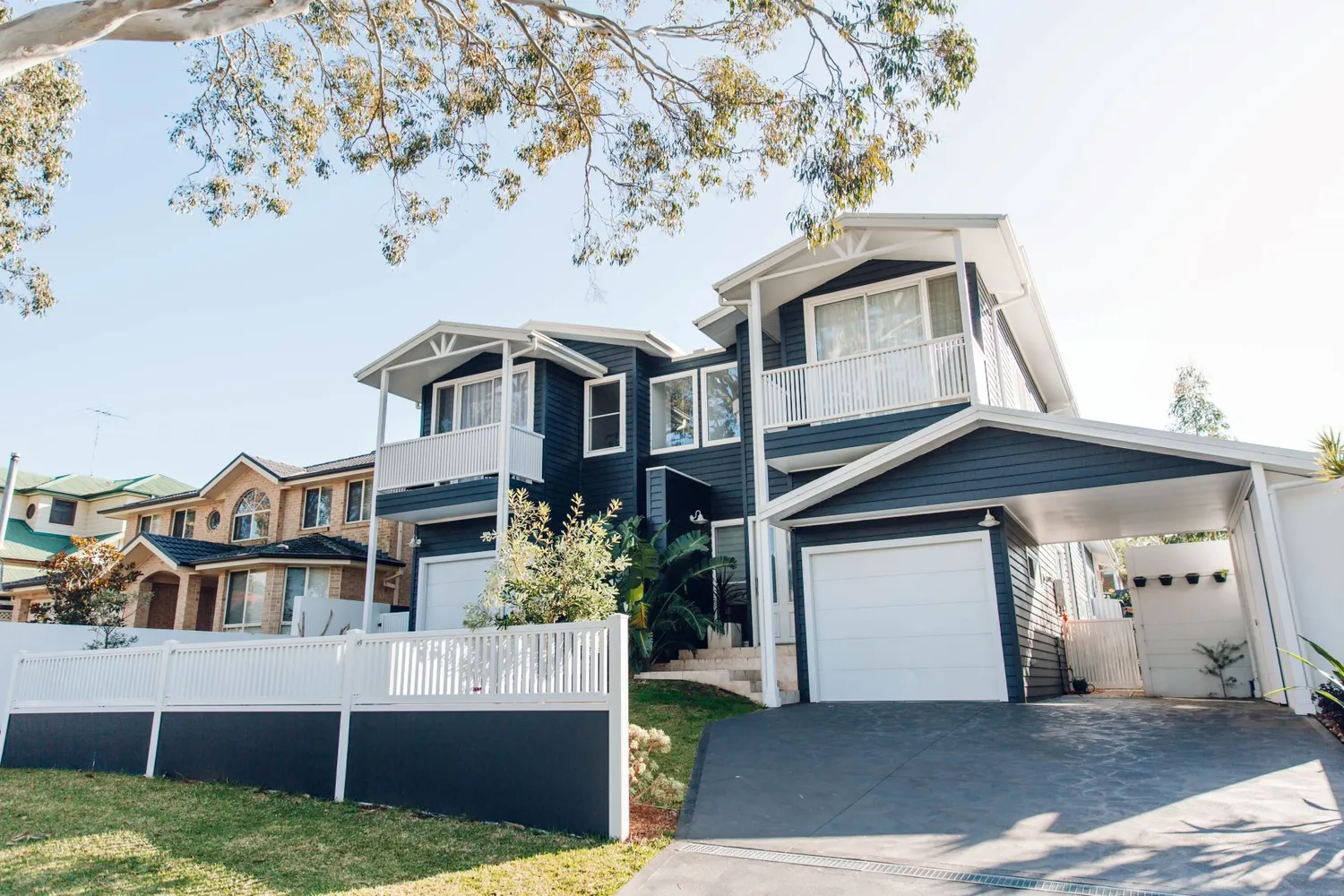
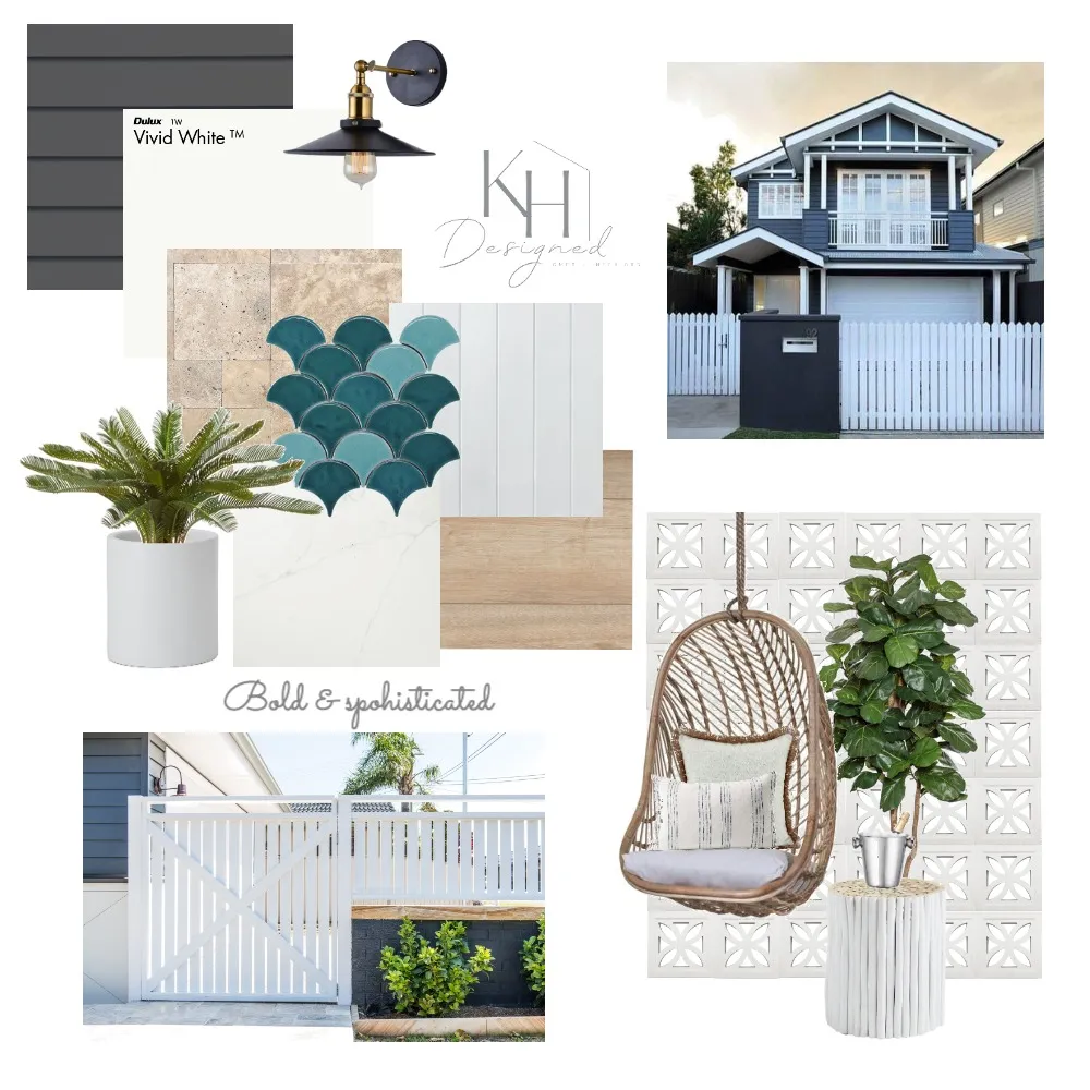 Contemporary Hamptons mood board designed by @k.hdesigned. View the mood board here.
"The challenge with this style is finding the perfect balance between making a bold impact with a contemporary minimalist approach. Choosing the right components to make your design statement while not overcrowding is key! Start with a dramatic dark James Hardie Linea weatherboard, highlighting thick surrounding trims in a crisp white. As you move towards more detailed areas, continue this trend by selecting a coloured or patterned feature tile and opting for a more minimal, relaxed feel in your other selections."
Katrina - KH Designed on creating a 'Contemporary Hamptons' facade
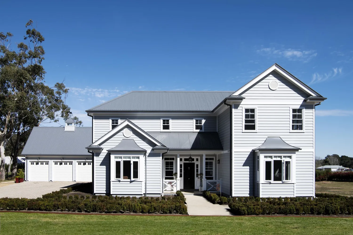
This look takes a lot of influence from the American Hamptons home. It is pretty, luxurious, and highly detailed. This look often suits sprawling homes with complex rooflines and layered decorative details.
Key elements include:
- Roof: Complex roofline with multiple open or box gables with shingle style roof tiles.
- Colour scheme: Slightly bolder and more colourful neutral colour palette with contrasting trims.
- Highly detailed. Think barge boards, arbors, fretwork, planter boxes – the works.
- Materials often used: Linea™ Weatherboards in 180mm or 150mm profile with mitred corners or bold white corners using Axent™ Trim
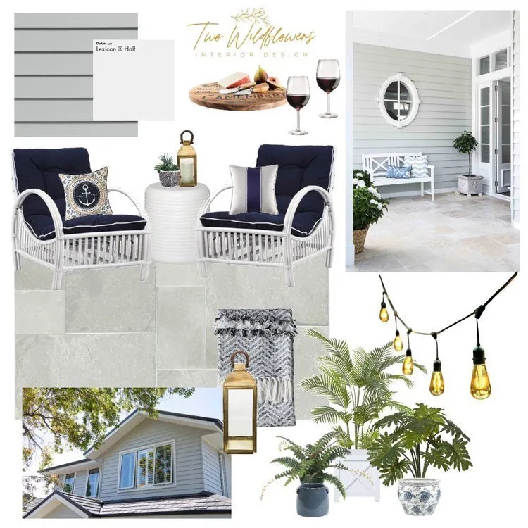
"There is nothing more relaxing than sitting on the alfresco sipping some wine while admiring your Traditional Hamptons facade. To create this look we paired Travertine French Lay Pavers with the Linea™ Weatherboards in Lexicon. With pops of crisp whites, navy blue decor and plenty of greenery, this brings the Traditional Hamptons right to your doorstep".
- Two Wildflowers Interior Design
To discover more of these facade styles, download James Hardie's Hamptons Lookbook here.
Now that you’ve discovered the different facade looks and what the main elements in each are, it’s time to bring your vision to life and create your facade mood board. We spoke to Maria Cerne from Studio Black Interiors, and she gave us her tips on what things you should include when creating your facade mood board.
Maria says, "First impressions and kerb appeal are super important when thinking about the exterior building materials for your home. What your home looks like on the outside is often a reflection of what it’s like on the inside, so it’s really important to set the right tone. Mood boards are a great way to visually show how you want the exterior of your home to look. I use mood boards all the time as a tool to help collate all my ideas".
 Maria Cerne from Studio Black Interiors
Maria from Studio Black Interiors' top tips when creating a facade mood board:
- Work out your exterior style - how do you want your house to feel – do you picture it making a strong visual statement or blending into the neighbourhood? Should it be classic, modern or a little more edgy?
- Consider where your home is located - is it in a metropolitan area, the suburbs, a rural or coastal setting? These different environments can inspire your colour and finish choices.
- Pick your trio – this is a good rule of thumb to keep in mind of terms of finishes. The idea is to have a trio of main finishes or colours. This may be mix of feature wall cladding, painted or rendered walls, bricks or stone. Base colours are used on the largest areas of your exteriors such as the walls, roof and the garage door, accent colours are used on smaller areas such as windows, trims, your front door, or other architectural features.
- Edit and refine - look at what is working and what isn’t, and make changes to the mood board until it feels cohesive. My advice is not to use too many colours and finishes on your exterior – less is generally more.
Don’t forget to share your facade mood board on Instagram and tag both @stylesourcebook and @jameshardieau so we can see your dream facade.
