Home Tours
Robert Street Project by Anita Woods from Mana Projects
Project Management and Design: Anita Woods from Mana Projects
Photographer: Dylan James Photography
Styling: The Real Estate Stylist
Builder: Drake Build
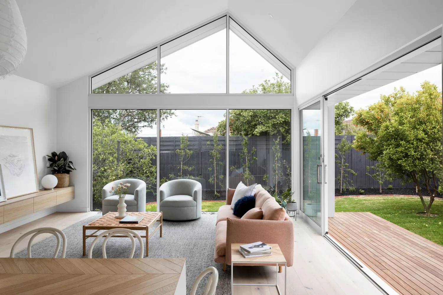
With its origins dating back almost a century, the Robert Street Project is a charming 85-year-old California Bungalow in the gorgeous suburb of Bentleigh in Melbourne. Having undergone a major renovation and impressive extension, the home has been given a new lease on life by the talented project manager and interior design and building enthusiast, Anita Woods from Mana Projects. Anita’s love affair with interior design really began after she project managed, designed, and styled the new build of a family home in Phillip Island. Cutting straight to the chase, her and her husband decided to purchase a house to renovate and move into once completed. Drawn to the charismatic features that California Bungalow’s offer, as soon as Anita laid eyes on this house, she knew it was the one. Prior to the renovation, the house had a faux mission brown brick look cladding from the ’80s covering the original weatherboard and a small rear extension from the ’70s. Fast forward a couple of years and the Robert Street Project is almost unrecognizable.
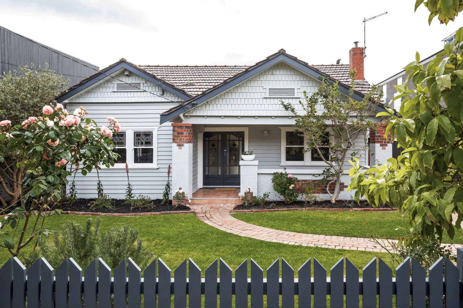
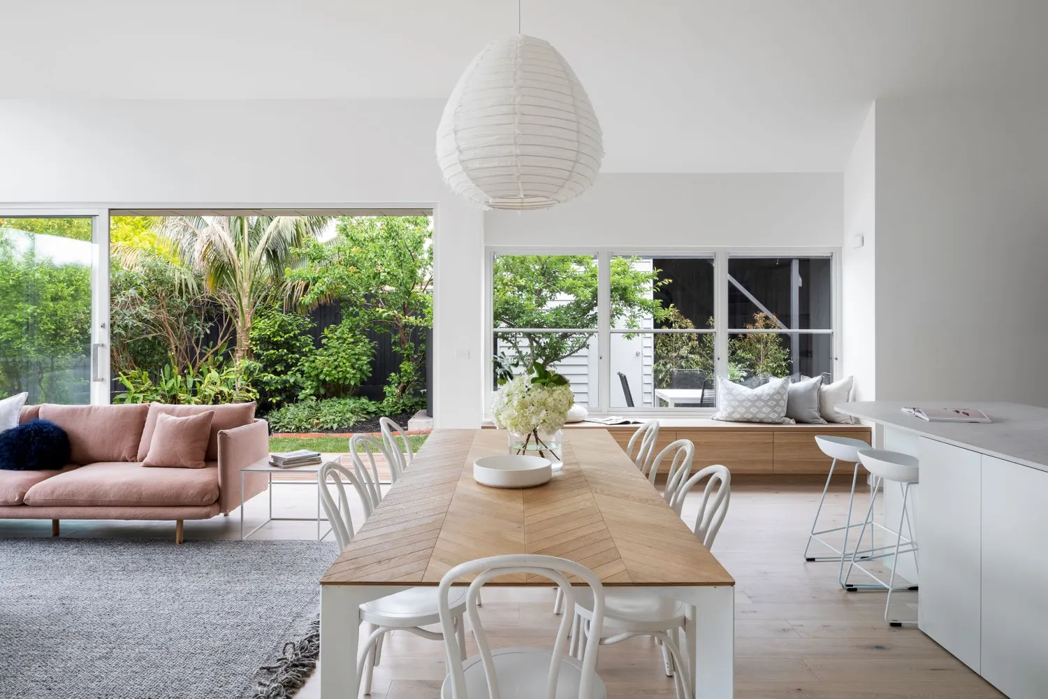
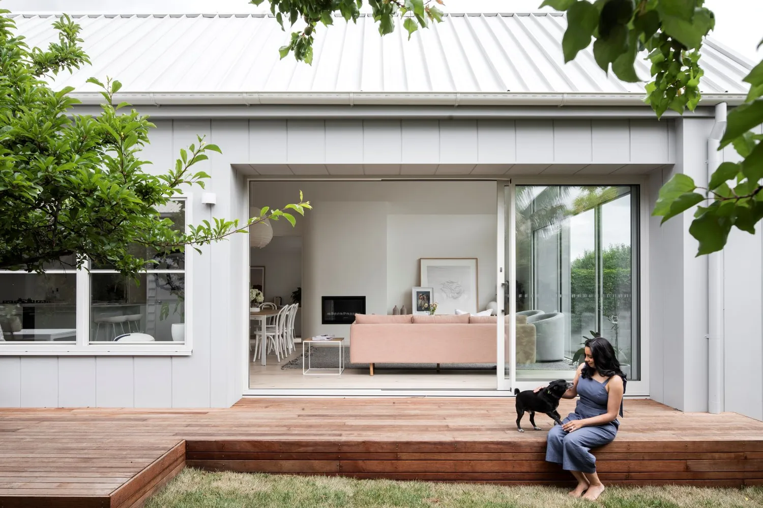
Anita worked with an architect from the very beginning as she knew she wanted to preserve some of the original bones of the home while seamlessly connecting it with a new contemporary extension. The way in which this was achieved was through keeping the period features in the front half of the original house, in the entrance and front bedrooms, while modernizing the interiors where necessary. The transition from the old to the new was made harmonious by the lengthened hallway that kept the original polished floors. This made for a natural transition from the original part of the house to the modern and light-filled extension. When it came to the design of the house, Anita had the vision to use height and angles to influence how the new part of the house was designed. Rather than make the extension a bold feature, the extension was hidden from the traditional facade showcasing the classic part of the house. Anita explains, “I wanted it to be full of unexpected surprises as you navigate through the house.” And full of surprises it is! From looking at the front facade you would never imagine the vast open-plan extension that lies behind. With ceilings that extend 4.7 meters high and large windows that create a light-drenched space, this is one surprise that is sure to delight all the home's visitors.
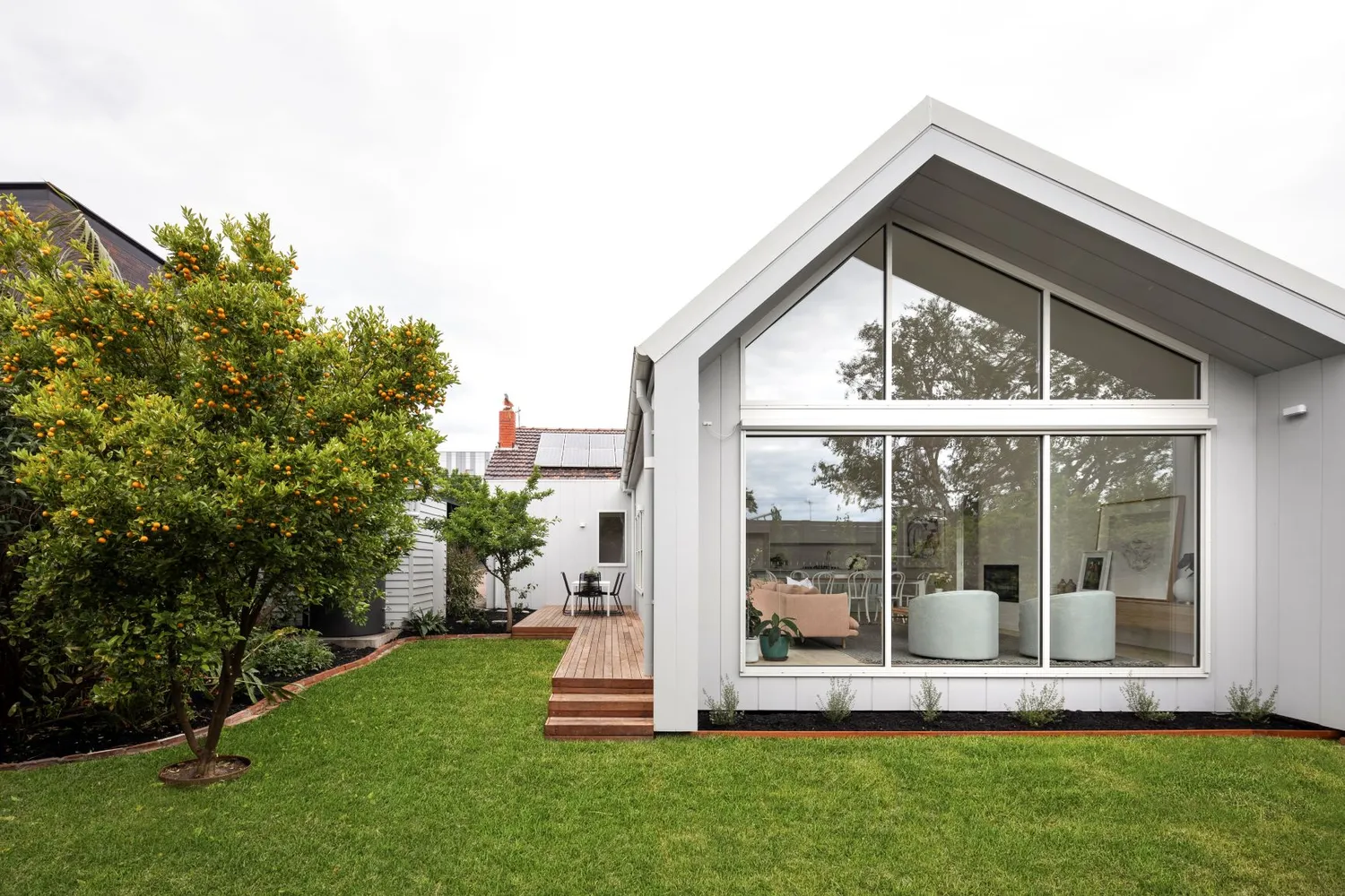
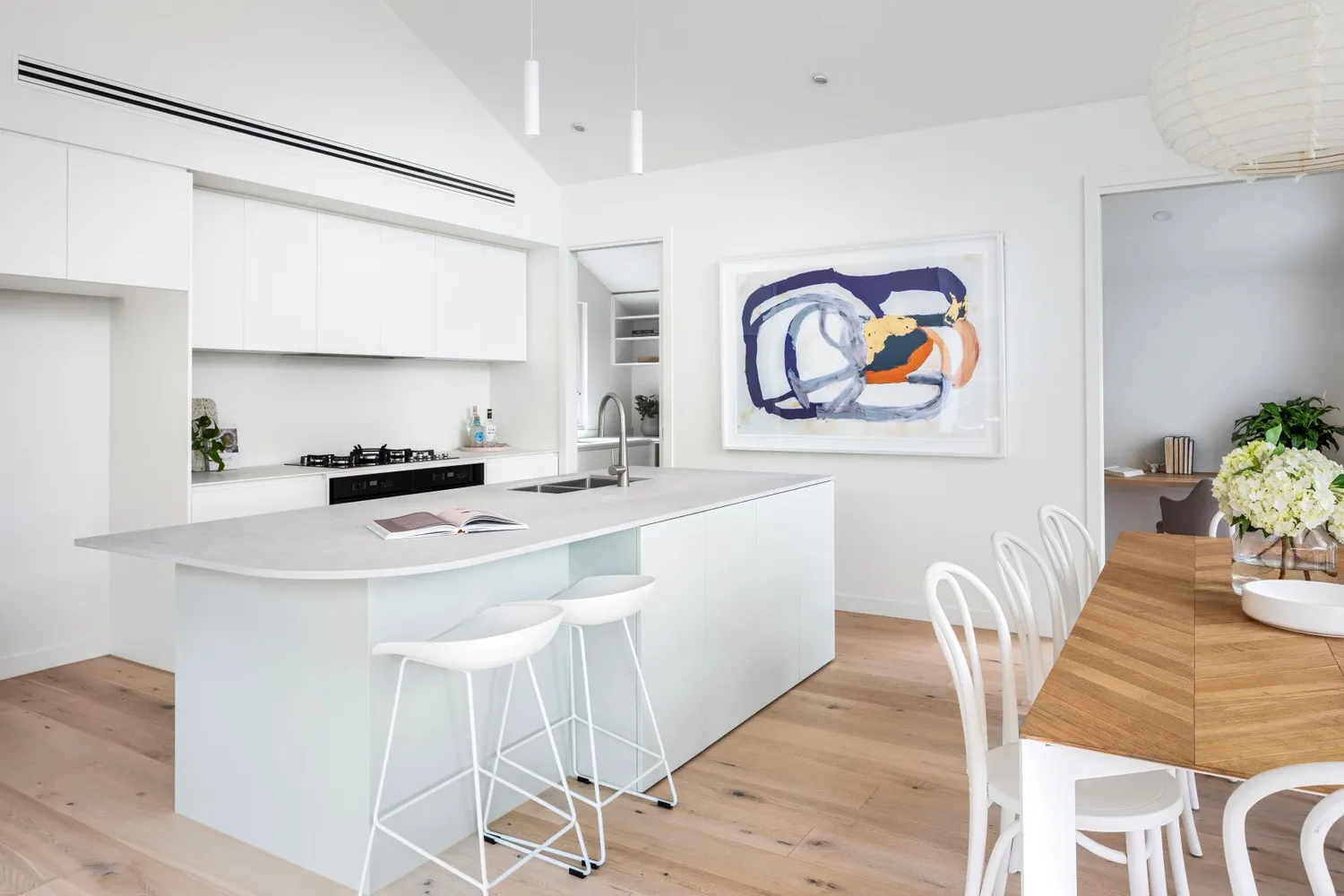
“I really wanted to create a home that is unique and carries design elements that make it memorable and special through a series of moments. The soaring raked ceiling and full height windows in the open plan area have an incredible impact on everyone that walks into the space and drenches the room with light and warmth. I have also used feature curves throughout the house to soften spaces.”
- Anita Woods, Mana Projects
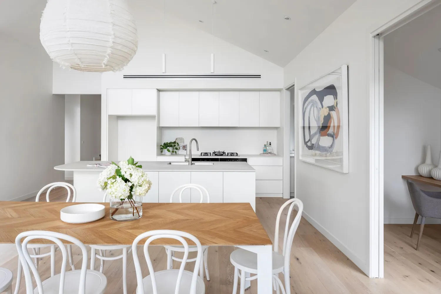
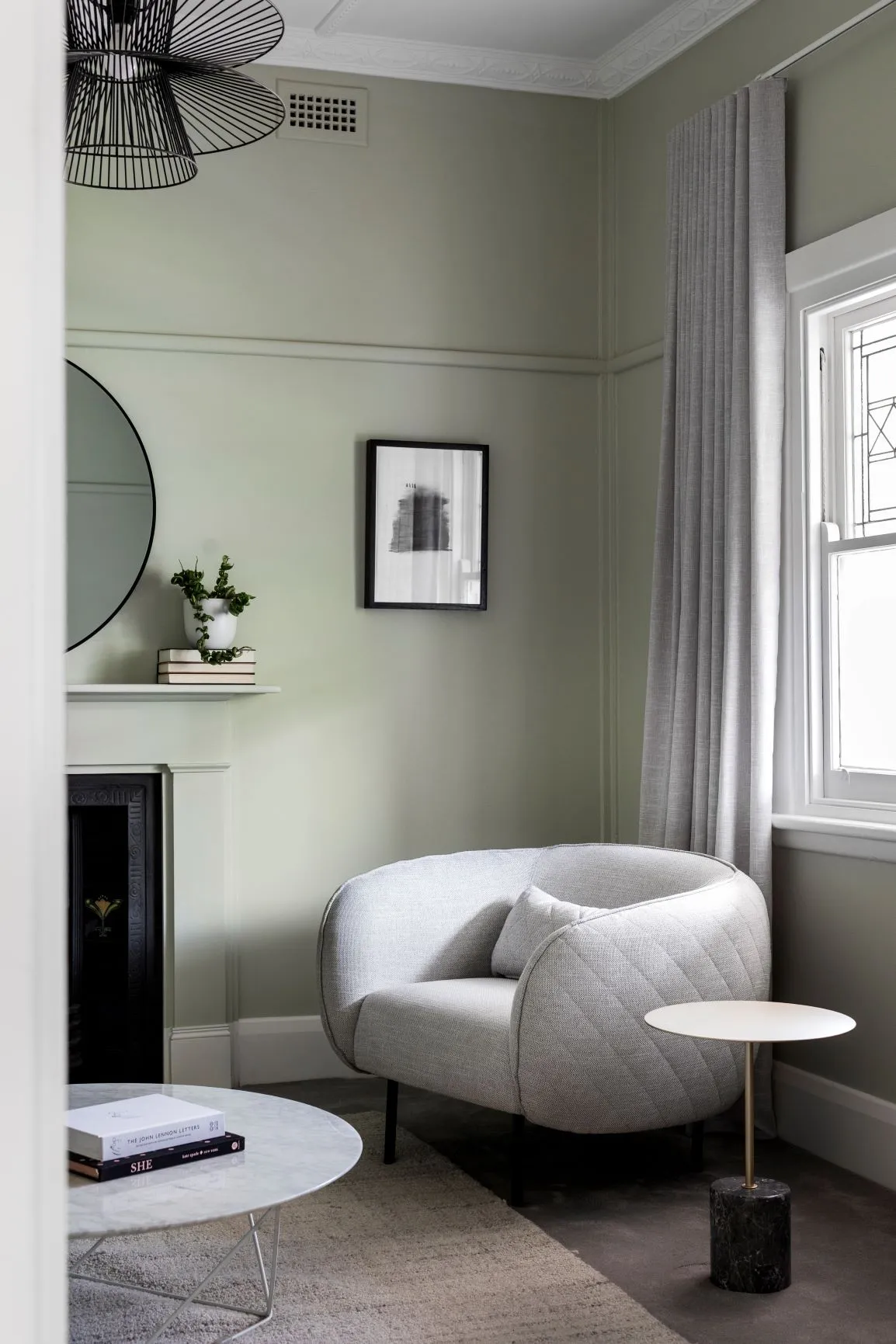
Like all good design projects, Anita first began by exploring what style the renovation would take. Inspiration was taken from the original colours of the house, like the soft green Dulux Lamb's Ear feature colour that can be seen in the lounge room, and through her love of architectural design. Anita chose timeless pieces and colours that had a modern touch to them. While the aesthetic and look of spaces are important, so too is the functionality and designing of a home that meets the needs of the people who dwell there. The home was designed and built to meet the needs of a family. This meant that the home was designed with four bedrooms, including a master bedroom with an ensuite and WIR, a larger main bathroom, a powder room, and a separate study. One of our favourite features in the home is the use of curves throughout. While the overarching feel of the home is quite modern, the use of curves in the shower screens, kitchen island, and fireplace softens the spaces and adds a lovely touch.
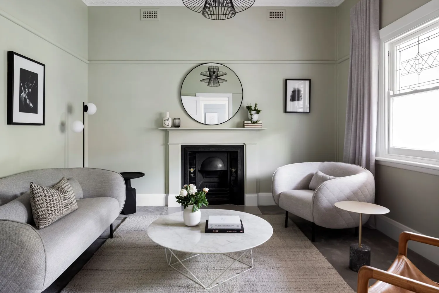 This wall colour is to die for! Anita used Dulux Lamb's Ear to pay nod to the original colour scheme of the home.
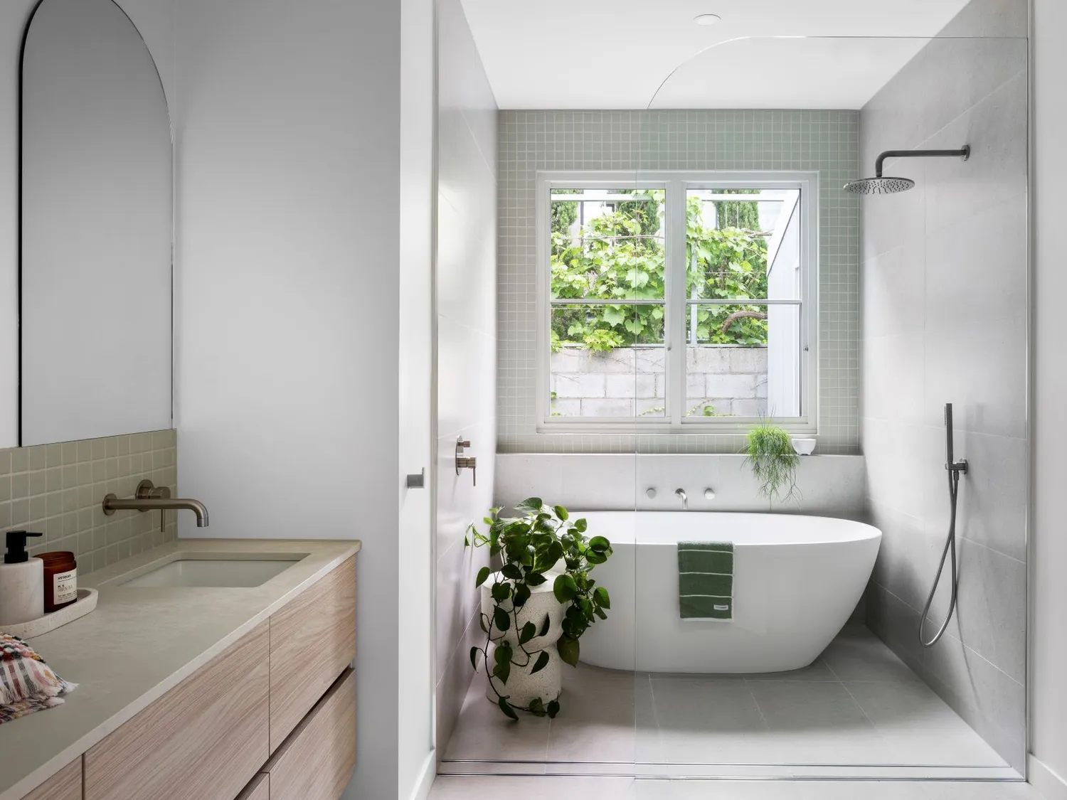
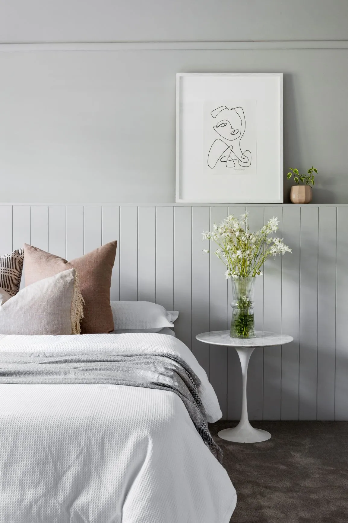
“To create a luxe feel, I also placed importance on quality fixtures and fittings including feature lighting and the use of colour. I tried to limit the amount of black and chrome finishes and took cues from the leadlights with the use of sage green in different parts of the house. I even used soft pink as a feature in the powder room which I absolutely love. There aren’t many houses in this area that boasts so many of these design features.”
- Anita Woods, Mana Projects
And it wouldn’t be a renovation without a few challenges thrown into the mix. Anita explained that finding a builder that understood her vision, budget, and who she felt was the right fit for the project was no easy feat. Luckily, she found Drake Build who was working on a local house when she spotted them, and couldn’t have been happier with the result. Another challenge was the fact that the house was preparing to be sold in 2020, amongst the crazy storm that was COVID-19. Nonetheless, Anita and her team pushed through and have created a home that is definitely one of a kind and one that they should be extremely proud of. This home exemplifies how the beauty and charm of heritage homes can be complemented by the contemporary and modern design era of today.
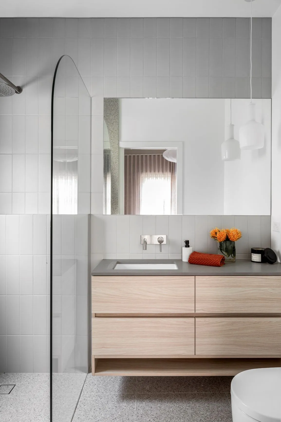
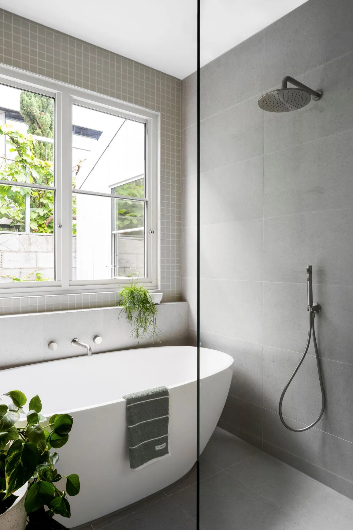
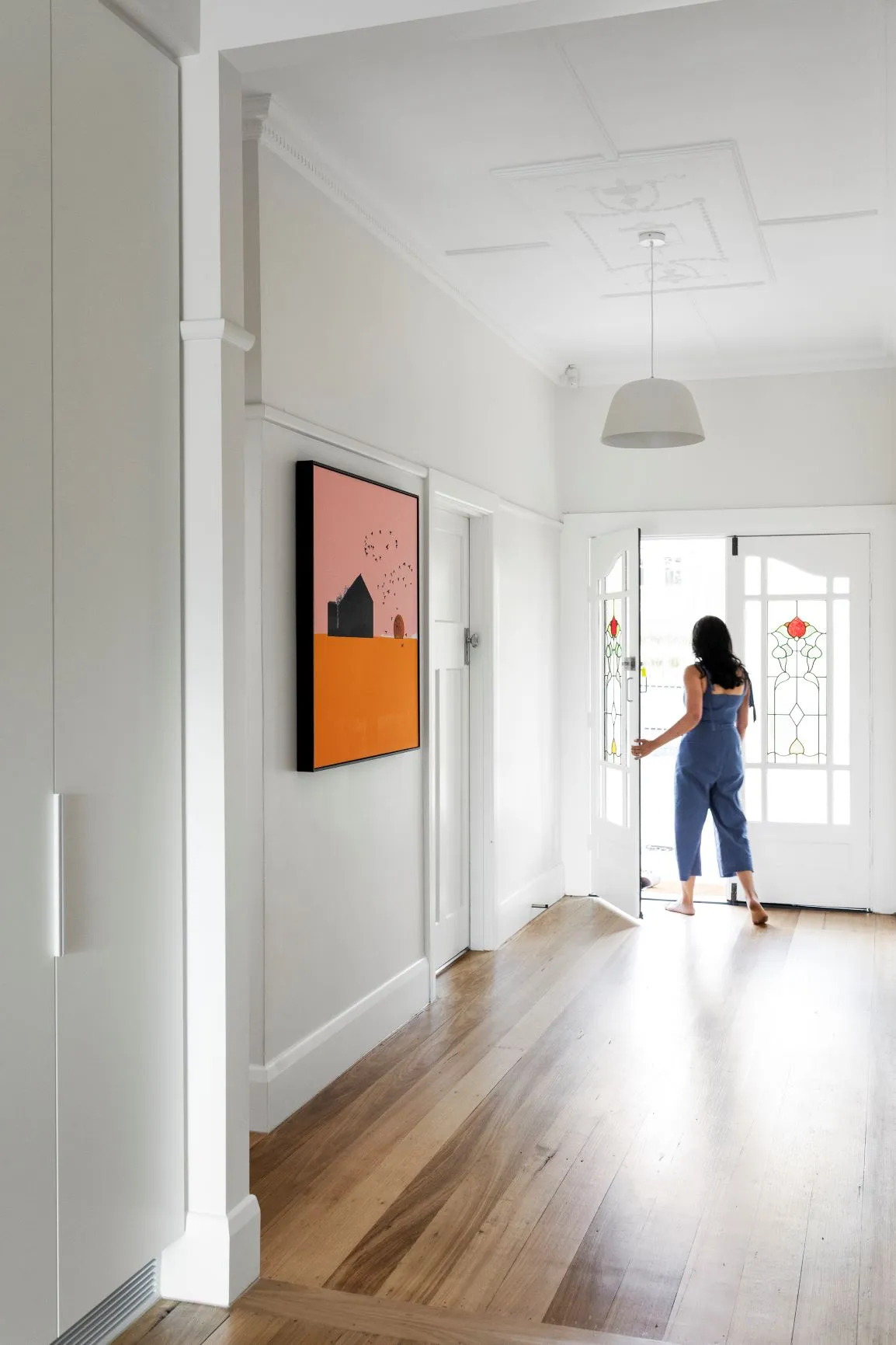
And because we can never go past a good before and after photo... These before photos are a testament to just how much work has gone into this renovation and how much of a difference good design and styling can make!
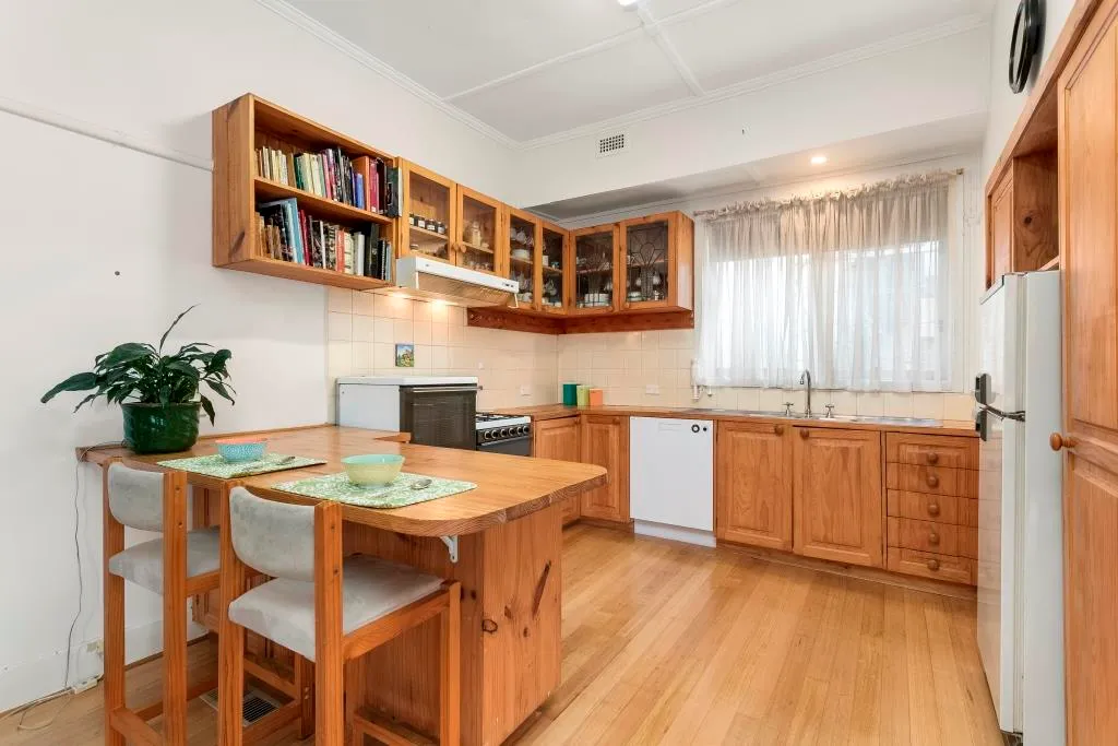 The before photo shows just how much love this home needed.
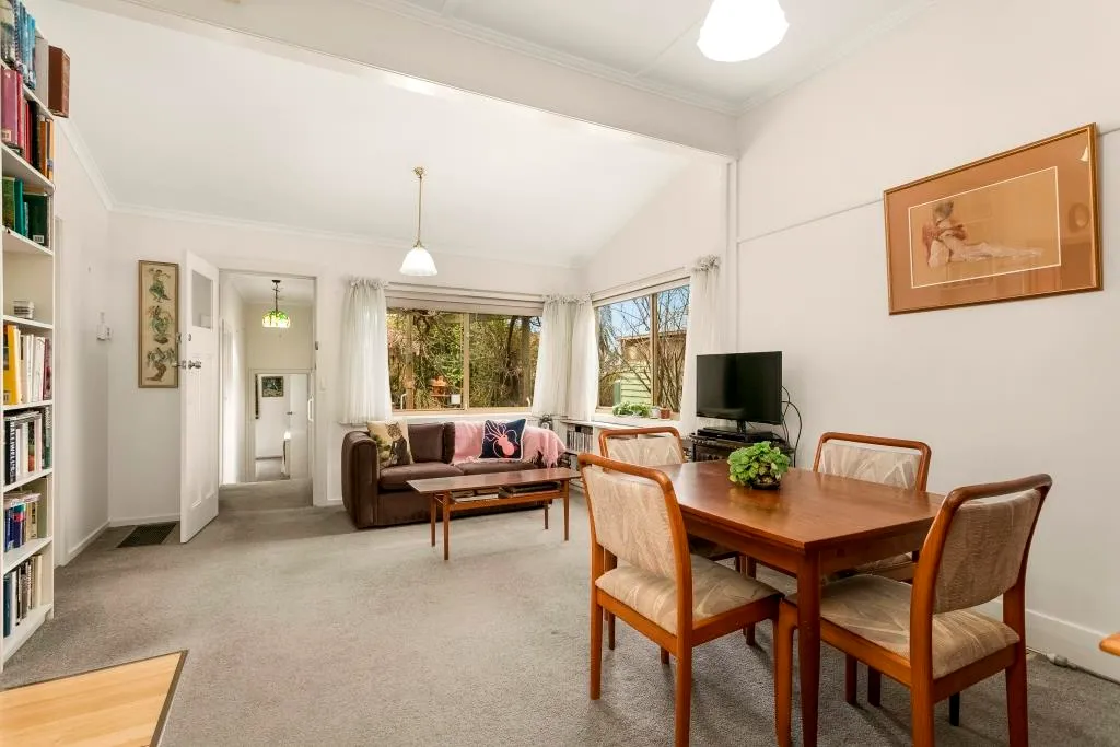 The new 4.5 meter raked ceilings make the world of difference.
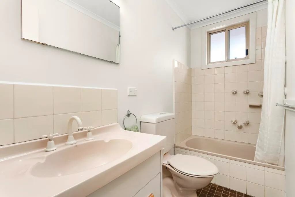 From drab to fab - the bathroom has had one heck of a makeover!
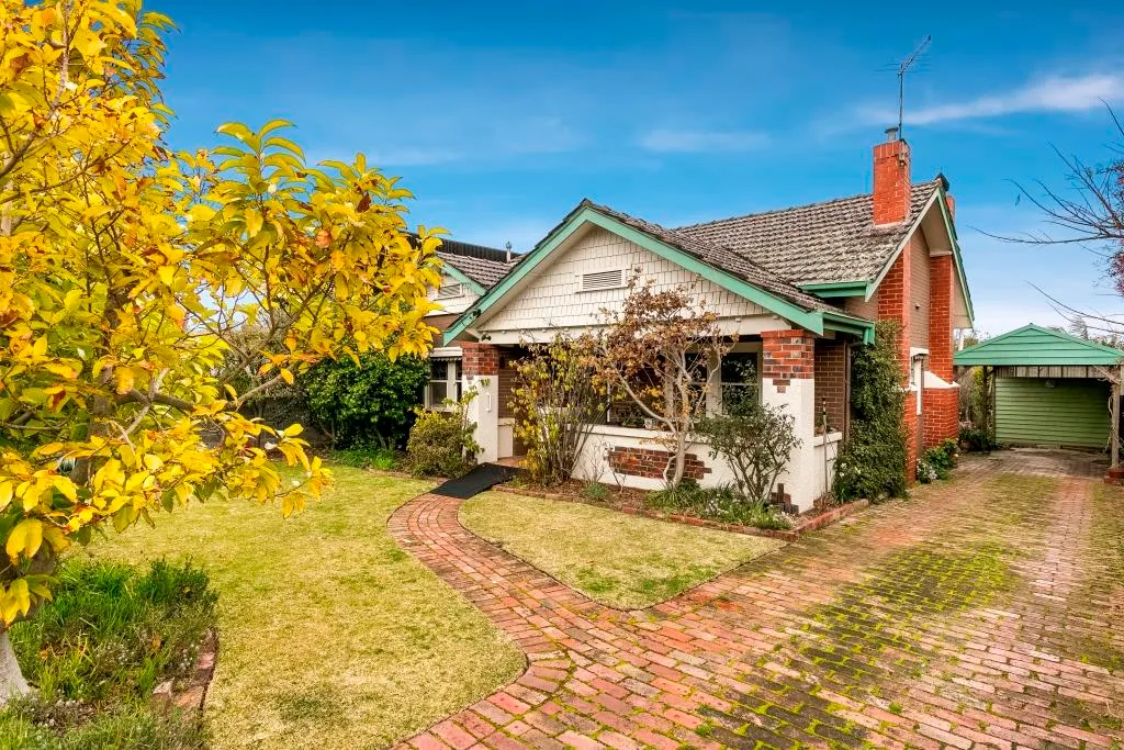 James Hardie Stria cladding was added to the facade to accentuate the home's original heritage roots.

