Home Tours
A Striking Mid-Century Modern Home Channelling Palm Springs
Architect: Nick Bell Architects
Instagram: @nickbellarchitects
Builder: Jakin Luxury Living
Photographer: Tom Ferguson Photography
Stylist: Emma Elizabeth Designs
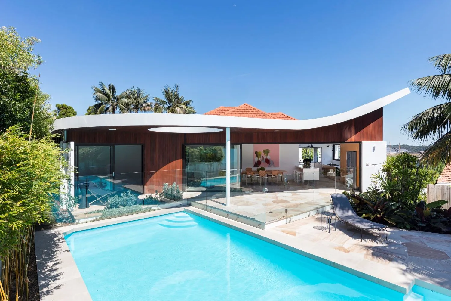
Located in the lush coastal Sydney suburb of Vaucluse, sits Olphert. The striking project is the definition of blending old with new to achieve a home full of personality and interest that reflects a holiday lifestyle. Inspiration was taken from the original 1960’s dwelling which was integrated with a new addition that channels Palm Springs energy. This gorgeous mid-century modern home boasts style, natural light, and the most incredible design of inside-outside living. Come with us as we take a tour with Nick Bell Architects, who give us insight into the Olphert project.
Thanks for taking the time to chat with Style Sourcebook! Can you tell us about Nick Bell Architects?
We are a Sydney-based boutique firm specialising in high-end residential homes. We are all about making space work for our clients and the way they like to live, each day. We design using quality materials that will last, from a durability point of view as well as aesthetically. We want our homes to endure. This is key to our sustainable design philosophy. We also design with light top of mind. Australia has such incredible natural light, so we draw on that resource through consideration of how light bounces throughout a space – window design and skylight placement are key – we also love a void.
Our team has a big love of the great outdoors, so designing homes that optimise indoor and outdoor living is an essential ingredient to all our designs.
We love the Olphert project, what was the inspiration for this house?
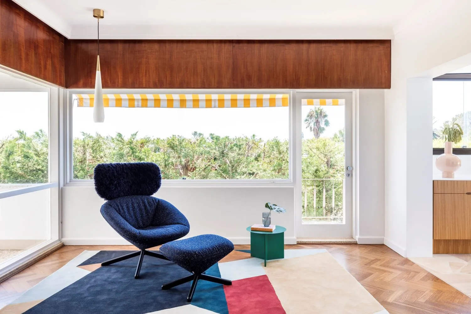
The project took inspiration from the existing mid-century dwelling. The best features of the original 1960’s house were preserved, and the new addition sought to emulate the style and glamour of the era in form and materiality.
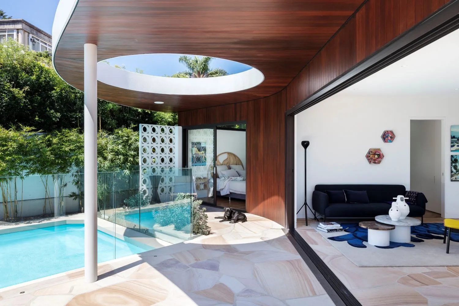
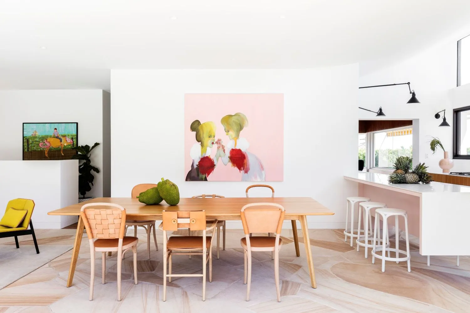
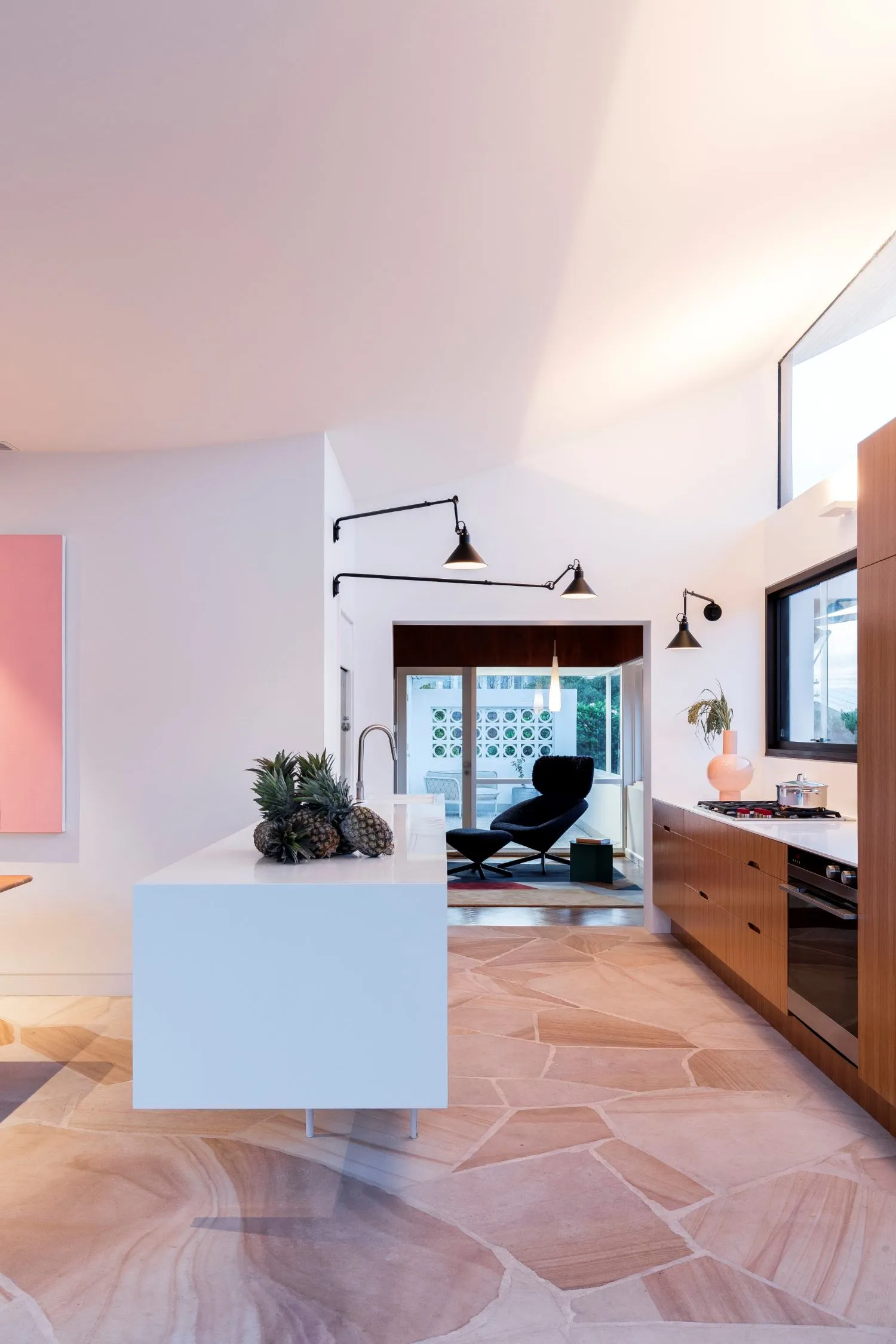
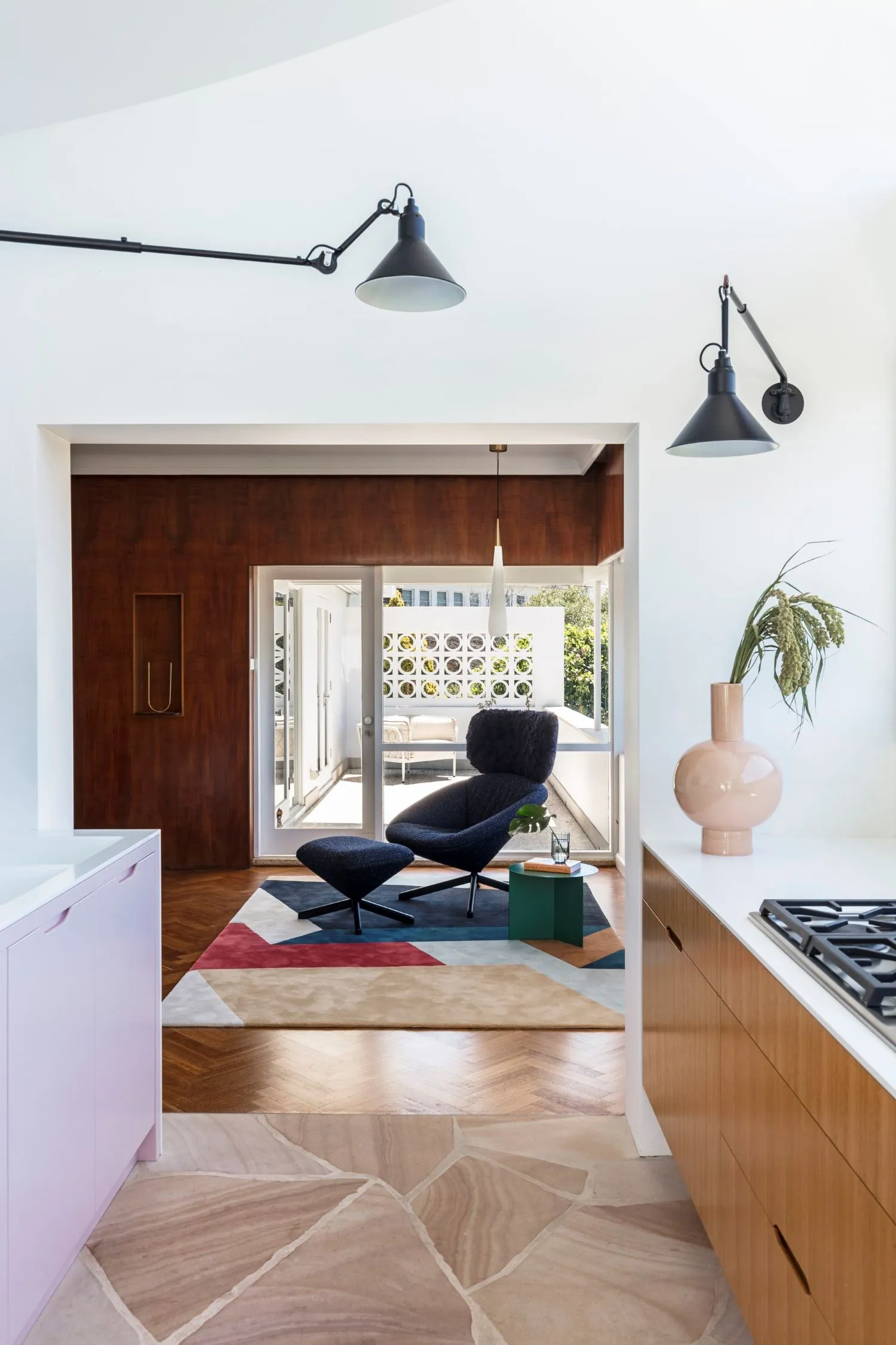
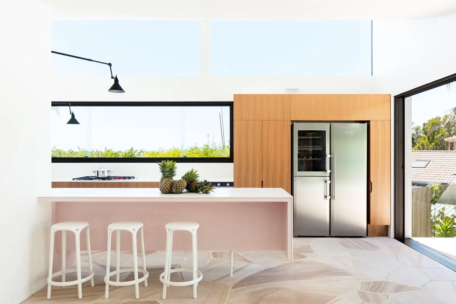
The mid-century modern homes and hotels of Palm Springs were particularly influential over the style and atmosphere we wished to create by the project. The rich palette of materials and playful sense of form mimic this design period. A contemporary edge to the design is provided by the large areas of glazing framed in bronze aluminium and sharp detailing such as the fine-edged kitchen benchtops.
Slim Aarons would feel at home here.
How did you maximise the space within the design on an irregular block?
The irregular site shape and triangular rear garden were constraints during the initial design phase. The ‘kinked’ plan of the extension was our response to maximise the use of the site and the connection to the rear pool area. The design very much aims to utilise natural lighting and ventilation: opening and bringing in the light enhances the sense of space.
The curved roof is incredibly striking, can you tell us about this design?
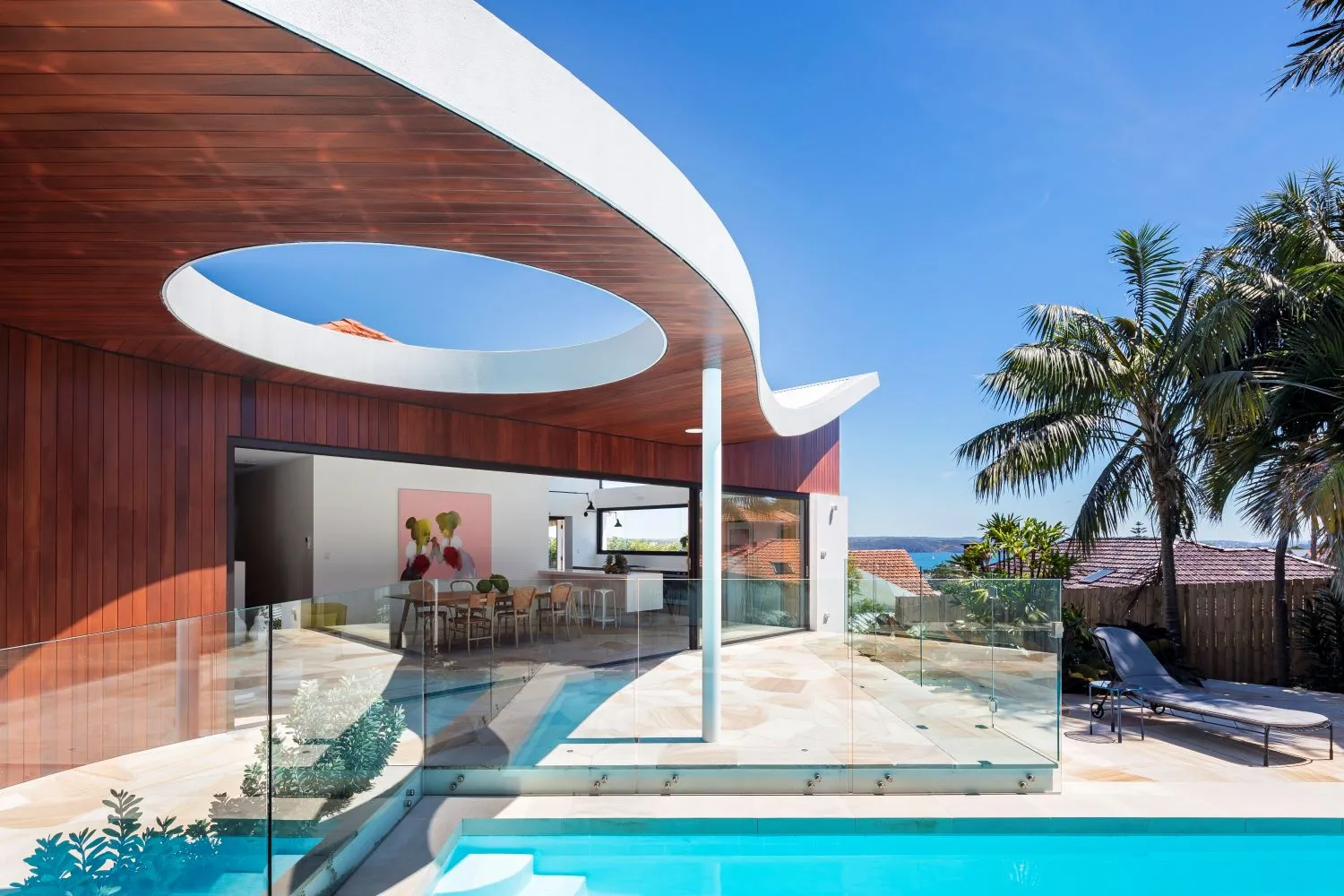
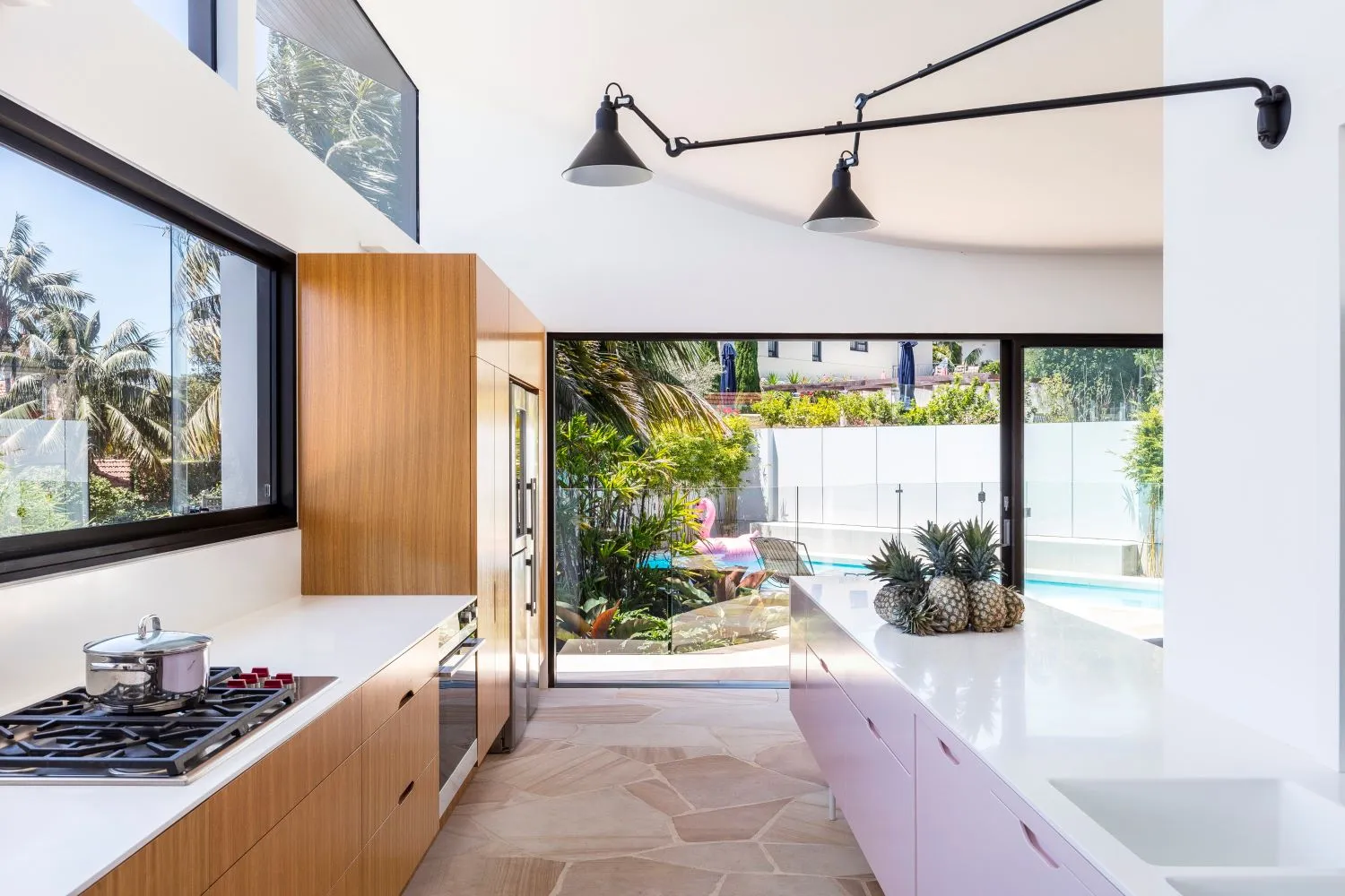
Glad you noticed it! The striking feature of the home’s design is indeed the rear roof structure, curving in plan and elevation. The roof pitches up over the new kitchen maximising northern light into the living space and then curving out over the pool terrace. Interesting rooflines are something that we are drawn to. While councils can control the confines, we like to give our homes the personality of their owners and give the design a point of difference. While we stick to the classics, we do like to push things a little.
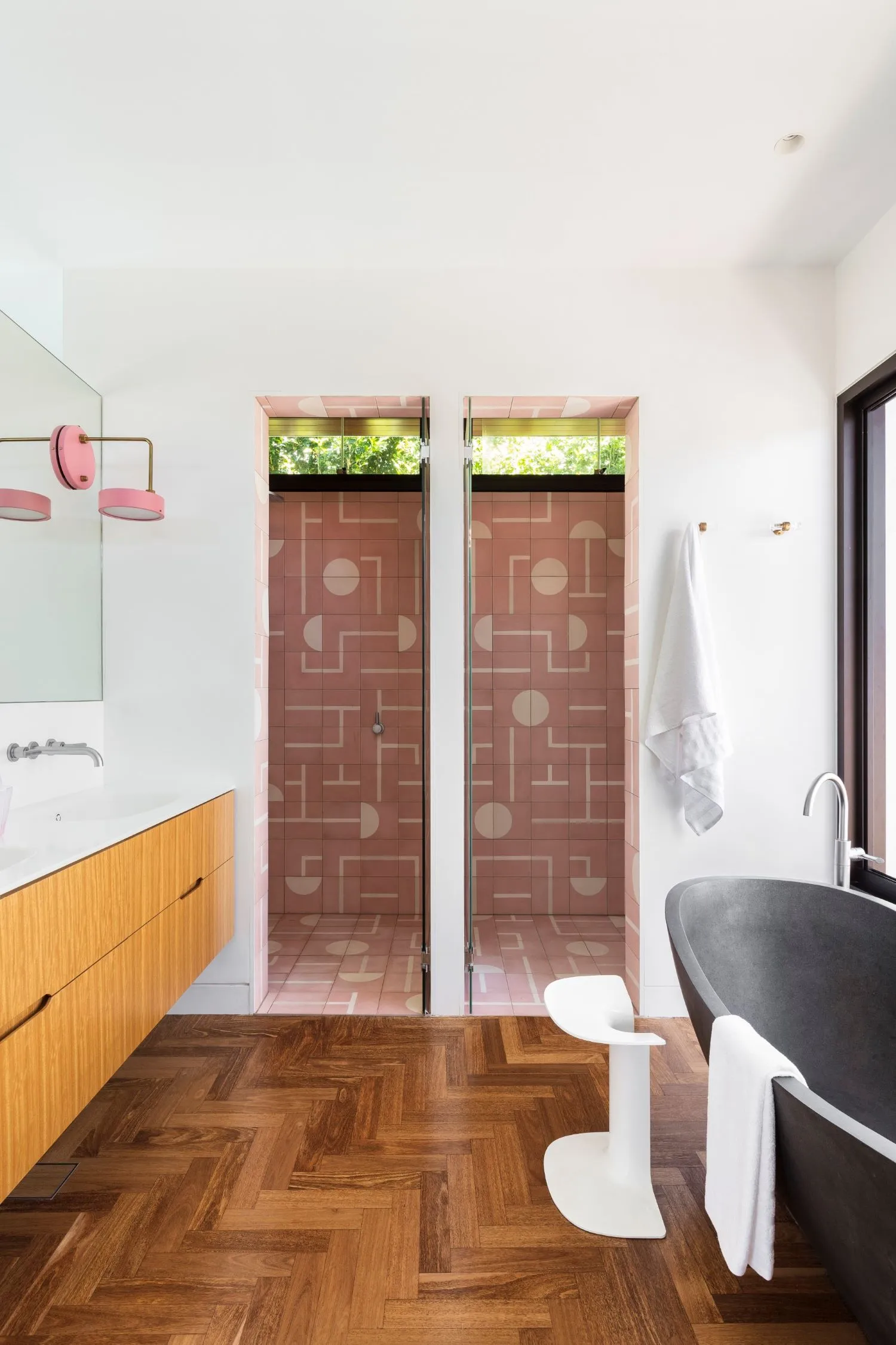
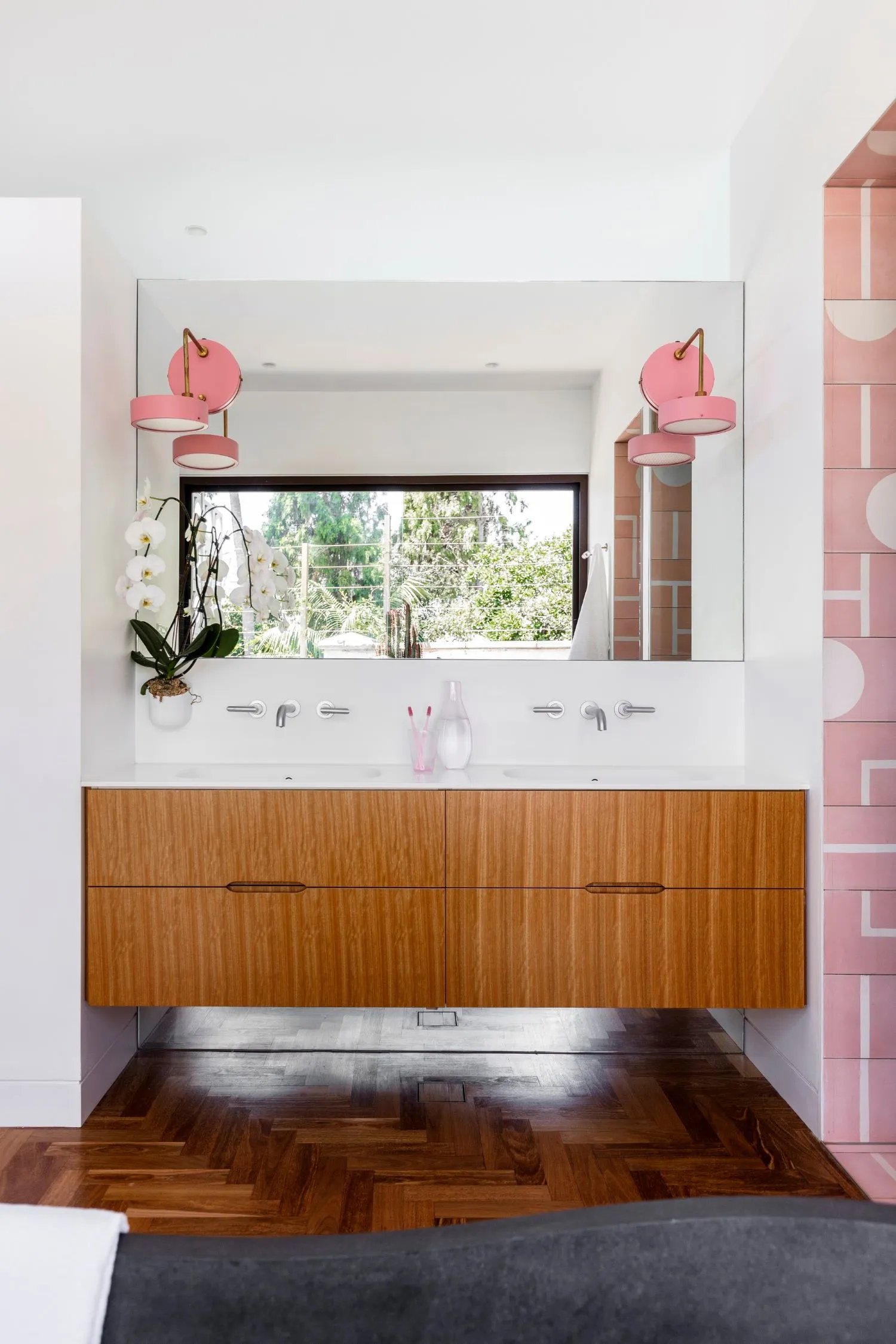
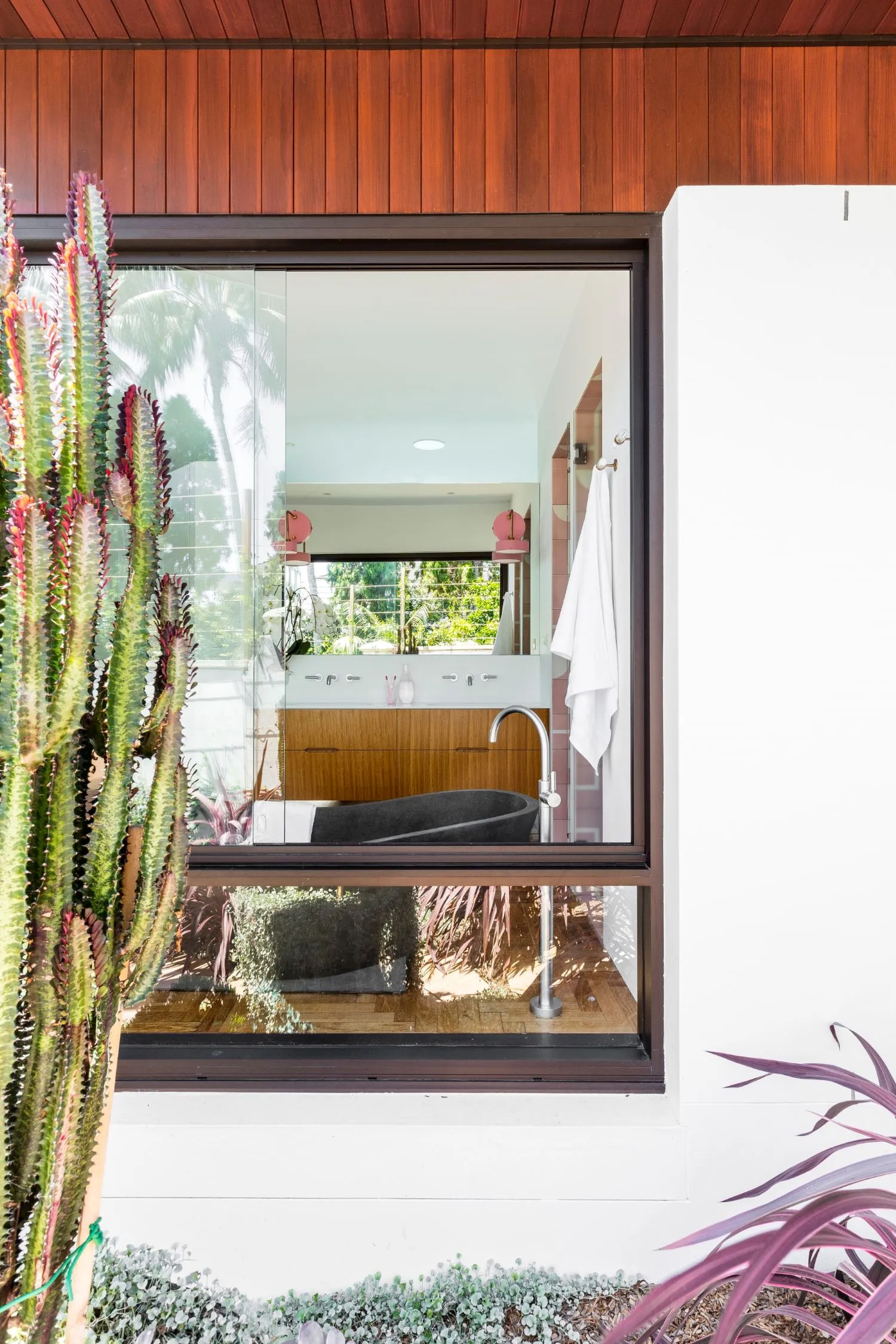
We love how the flooring flows from the main living areas to the alfresco, can you tell us about this feature?
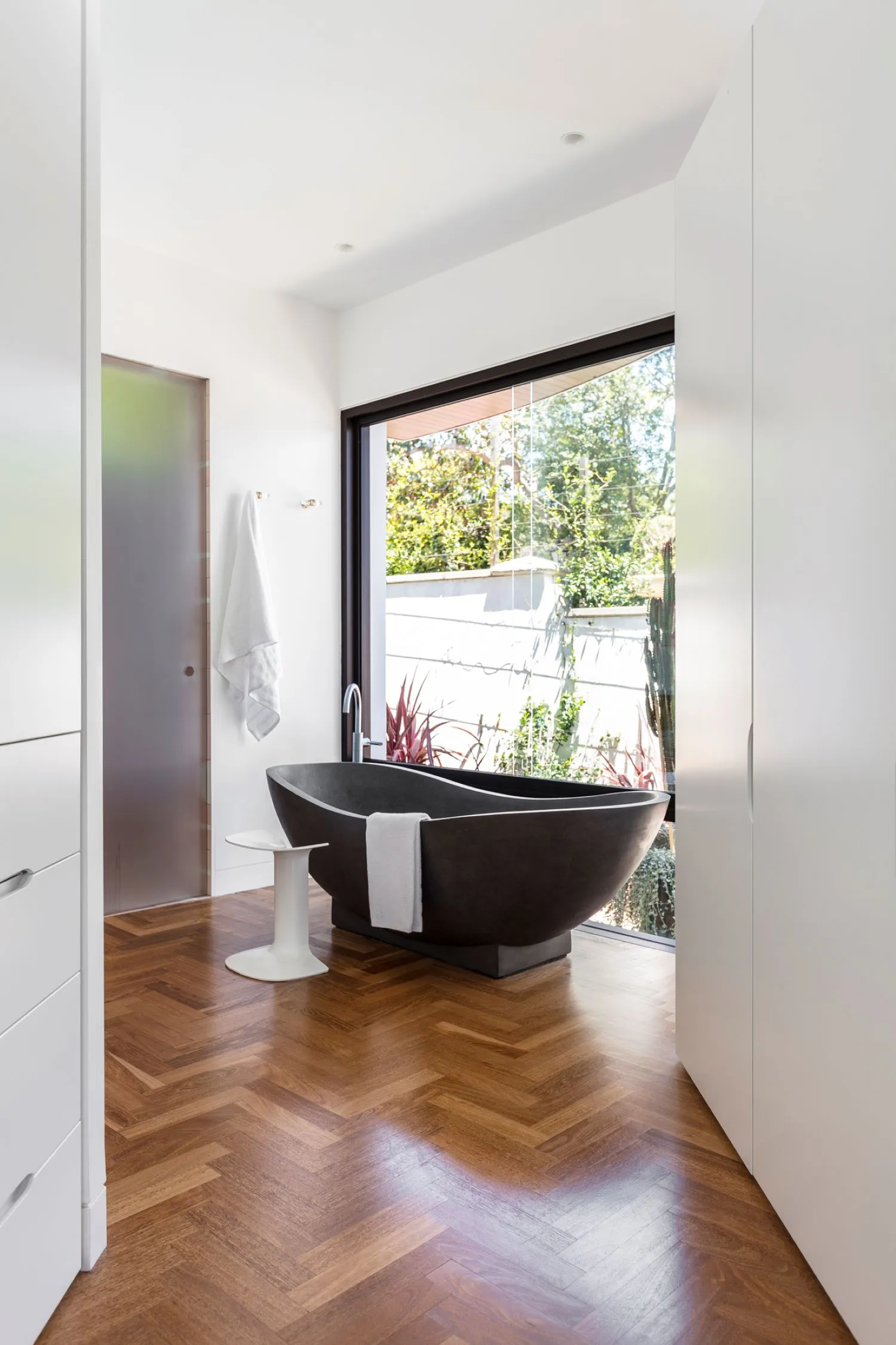
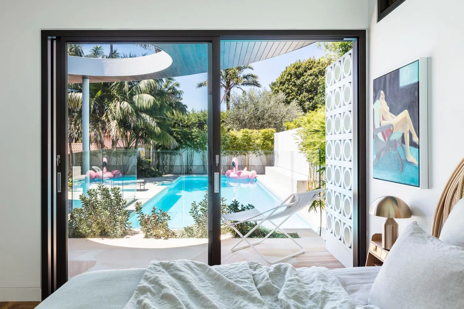
We love a seamless design bringing the outside in and inside out. The clients wanted to open the house up to the garden to provide an ‘oasis’ for entertaining around the pool. These needs were met through the refurbishment and remodelling of the existing dwelling and the construction of a new single-story rear and side extension.
Do you have any exciting upcoming projects we should stay tuned for?
We have two new homes coming out soon that talk to our love of an interesting roofline.
What is an element of building/renovating that people don’t often consider until they speak with architects?
Finding things within the walls! During construction elements of the existing dwelling required significant refurbishment and replacement due to their age and condition. As an example, feature screen walling was found to be made of asbestos piping and was replaced with concrete breezeblocks. These works added cost to the build and the extra challenge of maintaining the original character of the house while performing necessary rectification.
Also... Light – it's a natural resource. Two things to consider are the orientation of the home, the rooms, and the sun patterns throughout the seasons. We love to use light to create a sense of space. And finally... Good design is as much of what you leave out as what you put in, it’s all about the edit.
